
Your event registration page is the first real test of your attendee experience. And every click matters.
The difference between a 40% and 50% conversion rate isn't luck. It often comes down to one headline, one form field, or one button color that determines whether users bounce or convert. But here's the thing: You won't know which one matters until you test it. And what works for one event might tank another.
That's why event registration A/B testing is non-negotiable. It replaces “I think this might work” with “I know this works. Here’s the data to prove it.”
Let’s talk about how to run these tests, what to measure, and how the right event registration software makes the whole process shockingly simple.
Why event managers need to A/B test their event registration pages
One thing we’ve noticed: Most event registration pages are built on assumptions. You think you know what your audience wants, but do you really?
A/B testing gives you the answer (with receipts!). It’s your secret sauce to event registration optimization and driving demand generation. Here’s why.
You optimize for real behavior, not gut feelings
Your boss thinks the form is too long. Your designer thinks it needs more white space. You think the CTA should be bigger, bolder. But what do your actual attendees think?
A/B testing answers that question with data, not opinions. When you test different versions of your registration page, you see exactly how real people behave—where they click, where they hesitate, and where they bail.
For high-volume events, this matters even more. A 5% lift in conversion rate might not sound overwhelming, but when you're driving 10,000 visitors to your page, that's 500 extra registrations.
The bottom line: If you want to increase event sign-ups, you need to A/B test.
You create a culture of continuous improvement
The best event teams don't launch and pray. They launch, test, learn, and iterate.
Every event becomes an opportunity to get smarter about what works for your specific audience. And each test (no matter how small) creates learning opportunities that can compound across future events.
Maybe your tech audience prefers minimal forms while your healthcare audience wants to provide all the details upfront. Maybe mobile users convert better with a multi-step form while desktop users prefer to see everything on one page.
You'll never know unless you test your event registration UX.
And here's the best part: Once you find what works, you can apply those learnings across your entire event portfolio. That winning headline format? Use it everywhere. That form layout that crushed it? Clone it for next quarter's roadshow.
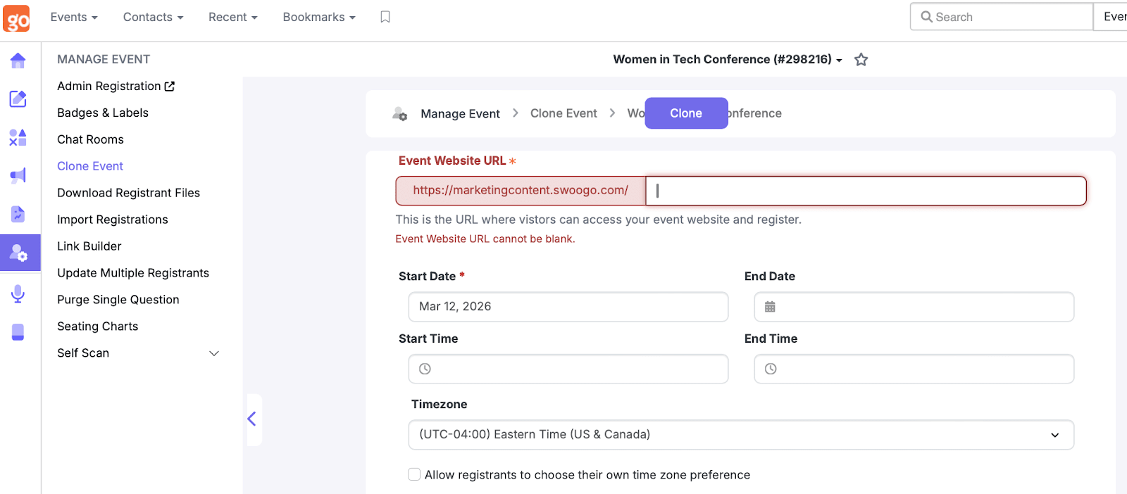
And with Swoogo’s cloning and automation features, finding what works means you can apply it across dozens of events instantly.
How to run an A/B test on your event registration page
Ready to stop guessing and start testing?
Here's your step-by-step playbook for running A/B tests that actually deliver insights. We'll walk you through everything from forming your hypothesis to implementing your winning variations across all your events.
Step 1: Define your goal and hypothesis
Every good test starts with a clear event goal and a specific hypothesis. Not "make the page better" but something measurable like:
- Goal: Increase registration completions by 10%
- Hypothesis: Reducing form fields from 10 to 5 will increase completions because it reduces cognitive load
Once you do this, you can create a list of metrics that you can actually track:
- Conversion rate
- Form abandonment rate
- Time on page
- Time to complete registration
- Mobile vs. desktop completion rates
Step 2: Identify what to test
The most important rule of A/B testing: Focus on one variable at a time. Testing five things simultaneously is a recipe for confusion. You want to answer: What change made a difference?
When it comes to what you should test, it’s important to acknowledge that some changes move the needle, others just move pixels around.
Let’s look at the components that are most likely to actually impact conversion.
Registration form design
The registration form is where dreams go to die (or thrive). Always consider event registration form best practices, but test these elements:
- Form length: Test out five fields vs. 10. Alternatively, test single-step forms against multi-step flows.
- Field types: Test dropdowns vs. radio buttons vs. text fields.
- Progress indicators: Assess if progress indicators (like “Step 2 out of 3”) encourage completion or if your completion rates are better without them.
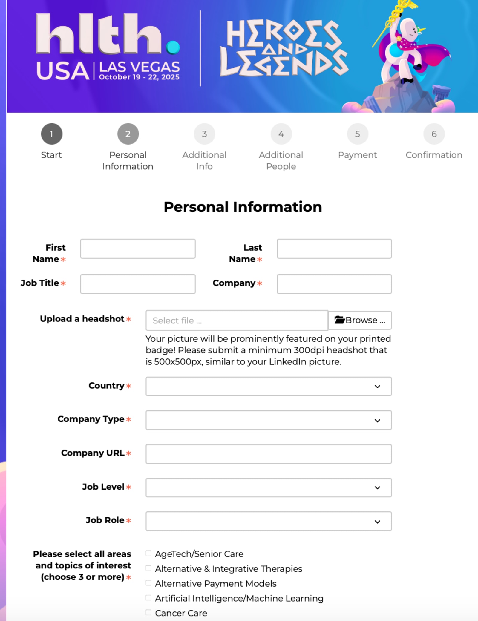
HLTH’s 2025 event registration form, for example, has a progress indicator visible throughout the entire process. Since it’s a longer registration form, seeing how much you have left (and what’s involved during each step) is helpful.
You can use Swoogo’s conditional logic to hide nonessential fields until relevant.
Calls-to-action (CTAs)
Your CTA button is the gateway to conversion. CTAs usually deliver the fastest wins, though this isn’t a rule of thumb.
Test everything about it:
- Copy: "Register Now" vs. "Save My Spot" vs. "Join 500+ Leaders"
- Color: Does your brand blue outperform urgent orange?
- Size: Bigger isn't always better (but sometimes it actually is). Test it.
- Placement: Above the fold vs. after value props vs. floating/sticky banner
- Microcopy: Add "Takes less than 2 minutes" above the clickable CTA to see what happens.
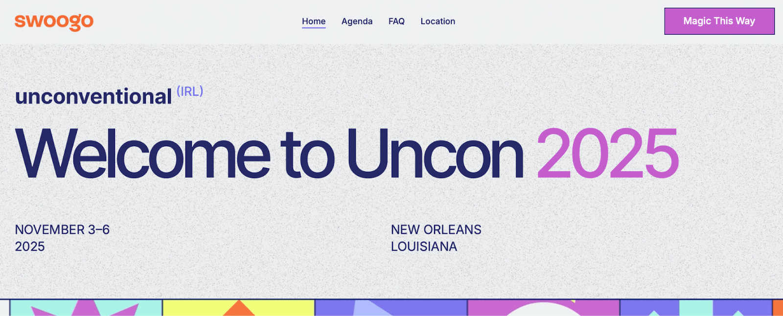
Don’t be afraid to get creative with your CTAs (as long as you’re testing!). Swoogo’s Unconventional IRL 2025 event, for example, has a bright pink “Magic This Way” CTA that follows users as they scroll through the page.
Page layout and visuals
Your event website and registration form design matters. You need to prioritize clarity and focus on building trust, and you can do this with the right visuals and page layouts.
Test the following:
- Hero images: Try event photos vs. speaker headshots vs. venue shots.
- Trust signals: Place logos, testimonials, and attendee counts above the fold.
- Video: Test embedding an intro video explaining the event. Does it help or distract?
- Layouts: Assess how page simplicity and information depth impact conversions.
In many cases, you want to focus on layouts that prioritize clarity over flair. Clarity always wins.
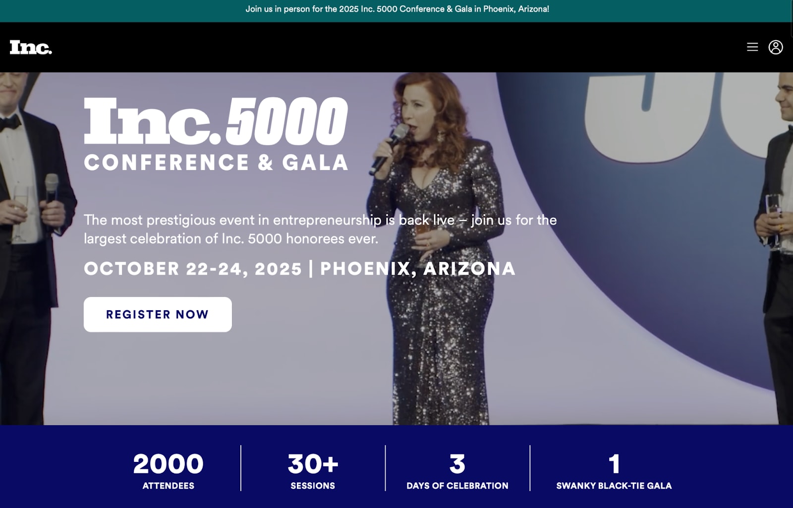
INC. 5000 Conference & Gala’s event registration page is a solid example of a simple page layout that gets the job done. It features a video in the hero, highlights key information like number of attendees and sessions, and explains exactly what the event is in a single sentence.
Want more inspiration? Check out these event landing page examples for a few ideas.
Messaging and value proposition
Your headline might be the first (and only) thing visitors read, so it needs to do some heavy lifting. The right message can mean the difference between closing the tab or signing up.
Test different headlines or subheadings:
- Direct vs. aspirational: "Join 500+ Leaders at [Event Name]" vs. "Your Next Big Idea Starts Here"
- Specific vs. broad: "The #1 SaaS Conference for Revenue Leaders" vs. "Transform Your Business in 3 Days"
- Length variations: “The Must-Attend Conference for Startups and Founders: Discover How to Grow From 0 to 100,000 Users” vs. “Growth Tactics for Startups”
Keep in mind that sometimes shorter, direct copy converts better than elaborate value statements—but not always.
Oh, and don't forget to test your tone. Professional and authoritative might work for C-suite events, while casual, energetic, and a little unhinged could crush it for startup gatherings.
Social proof and urgency
Nothing motivates action like knowing others are already taking it. Social proof and urgency tap into powerful psychological triggers that can increase conversions significantly.
Test these elements:
- Limited-time offers: Test countdown timers for early bird pricing or registration deadlines.
- Testimonial strategy: Assess different testimonial placements (above vs. below the fold) and quantity (one powerful quote vs. multiple perspectives).
- Live social validation: Try dynamic elements like "23 people registered this week" or "Currently viewing: 47 soon-to-be attendees."
- FOMO triggers: Implement copy like "Only 50 spots remaining" or "VIP passes 80% sold."
The key is authenticity. Fake urgency backfires, but real scarcity and genuine testimonials build trust while driving action.
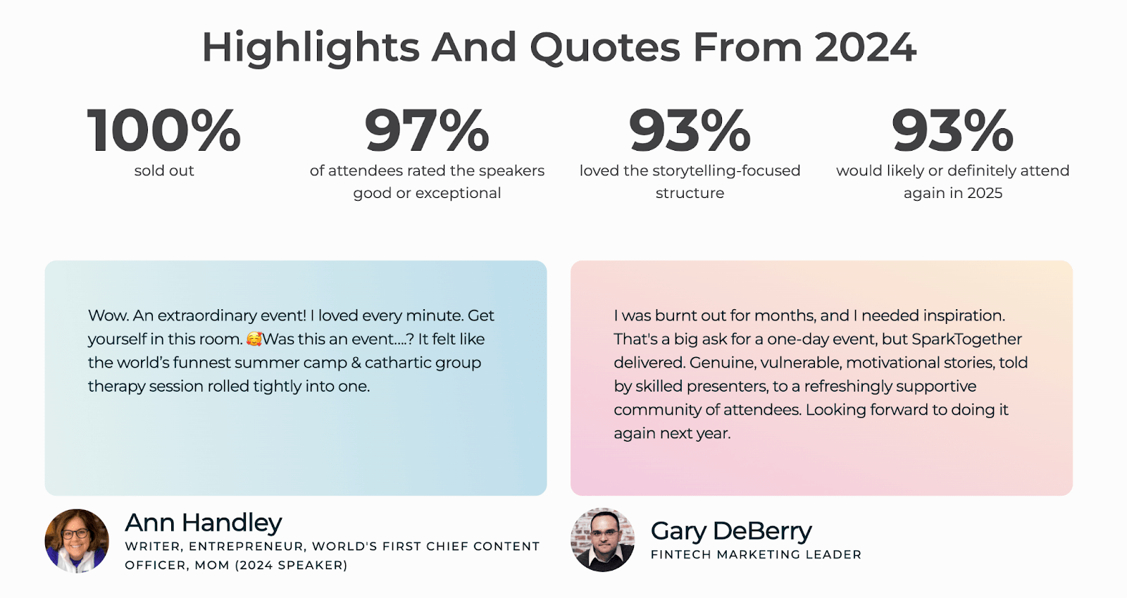
SparkTogether’s 2025 event page, for example, reminded users that the previous year was 100% sold out and that 93% of attendees wanted to attend again. Combined with testimonials immediately below, this could help generate urgency.
Step 3: Run the experiment
Now comes the fun part—actually running your test. But there's a right way and a wrong way to do this. Follow these guidelines to ensure your results are actually meaningful.
Use your A/B testing tool (or Swoogo's built-in analytics with a split URL setup) to create your test.
Send 50% of traffic to version A (your control—the current version) and 50% to version B (your variant—the new version you're testing).
Here's the critical part: Keep the test running long enough to reach statistical significance. For most event traffic, this means two to four weeks. And yes, you'll be tempted to peek after day three (or five minutes in). Don't. Early results lie. (Or at the very least, don’t take action yet if you absolutely have to look.)
Make sure both pages get similar traffic sources. If you send your best email list to Version A and cold Facebook traffic to Version B, you're skewing the results. Keep a level playing field. .
Step 4: Analyze and interpret results
The test is done. You have data. Now what? This is where most teams drop the ball—they see a winner and move on. But the real value is in understanding what the data tells you.
Look beyond the winner
Don't stop at "Version B won by 15%." Dig deeper.
- What specific behavior changed?
- Did people move through the form faster?
- Did mobile users respond differently than desktop users?
Review your form analytics to see the full story:
- Where did people pause or hesitate?
- Which fields caused the most drop-offs?
- How far did people scroll before bouncing?
In Swoogo, you can use the event analytics dashboards to see exactly where registrants hesitate or abandon. This granular data turns a simple win/loss into actionable insights you can apply everywhere.
Apply learnings across other events
Found a winner? That's just the beginning. Once you've confirmed what works, clone that setup for your next event in Swoogo.
Then, document what worked and why so your data stays actionable for future events. Create a testing journal that captures:
- What you tested
- What won (and by how much)
- Why you think it won
- How you'll apply it going forward
The best teams treat these learnings like company assets. They scale knowledge across events, share insights between team members, and build on each test. Your Q1 registration test becomes Q2's improved performance.
Step 5: Keep iterating with new ideas!
Testing isn't a project with an end date. It's an ongoing process that makes every event better than the last.
With every event, test one new thing. That new thing could be:
- A streamlined form design for your developer conference
- A fresh incentive structure for your customer summit
- A different CTA approach for your roadshow series
Over time, these tests compound into better UX, higher conversion rates, and smarter data-driven decisions. You're not just improving individual pages, you're building institutional knowledge about what your audience actually wants.
With Swoogo's automations, you can even trigger alerts or workflows based on test outcomes.
Let’s say you run a test and Variant B converts 20% better than Variant A. You can automatically notify your team and update your template library. This helps testing become part of your operational flow instead of an add-on admin task.
A/B test to your heart’s desire in Swoogo
We've covered the what, why, and how of A/B testing. Now let's talk about making it actually happen without losing your mind.
With Swoogo, you can build and compare custom registration paths for each audience type using unlimited conditional logic.
Want to test a VIP flow against your standard registration? Different forms for first-time versus returning attendees? Done and done.
Here's what makes testing in Swoogo different:
- Compare custom registration paths using conditional logic.
- Clone, adjust, and measure every experiment (no dev help required).
- Built-in analytics and reporting show exactly which design, CTA, or message performs best
- Automate follow-ups and alerts with “if-this-then-that” workflows based on registration behavior
- Test different paths by creating completely different registration experiences based on audience segments
- Track everything to see where people succeed, struggle, or bail in real-time
And here's the kicker: Swoogo's flat, user-based pricing lets you test freely, without worrying about per-registration fees. Run 10 tests or 100. Doesn’t matter, your costs stay the same, with no penalties for experimentation or pre-registration fees.
The best registration experiences are never “done.” They’re tested, refined, and made easier with every event. With Swoogo, you can test without limits, learn faster, and turn small insights into big wins. Curious? Let’s chat!