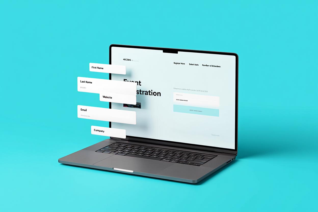
Your event website starts working before your event does. If your site isn’t doing some seriously strategic heavy lifting, you’re leaving registration, engagement, and ROI on the table. Use these tips to ensure your goals inform the layout, design, and flow of your event site (and not the other way around)—so you can make sure you hit them.
1. Define Your Website Goals Early
Sure, your event has goals, but your website has its own job to do. When you identify these goals early on, each content or design decision gets much easier to make because you’re laddering it up to something specific.
The list of goals likely includes:
- Generate hype and anticipation
- Deliver clear, timely info
- Convert registrations
- Make your audience want to take action
Treat it like your event’s digital concierge. It’s the first impression any potential registrant will have of your event, as well as its digital homebase.
2. Be Audience-First, Always
Different audiences need different things (shocker). But too many event websites forget this. Make sure your content and design is structured to serve the attendees you’re targeting.
Consider:
- Who’s coming to this site? First-timers will need different information from returning attendees
- What do they need now—before, during, or after the event?
- What tone, visuals, and flow will click for this audience?
Your site is for your attendees, not your internal team. Design it to speak their language—literally and visually.
3. Nail Your Navigation
Think of your website navigation as a GPS, not a maze. The basics include: Home, Agenda, Speakers, Registration, FAQs, etc.
More importantly, make your content structure intuitive, skimmable, and obvious.
Attendees shouldn’t have to click seven times to figure out where, when, or how. Get them where they need to go, fast. Your event technology should help you strike that balance between function and flair on your website.
4. Don’t Just Prioritize “Pretty”
A polished event site is great. A high-performing one is better.
Making it beautiful is one thing, but your highest priority should be making sure it’s functional, easy to digest, and designed to drive action. Attendees should be pushed to take action quickly.
Shape how visitors instantly experience your site with these factors:
- Strong layout hierarchy with digestible info
- Accessible colors and fonts
- Smart use of visuals that enhance content, never distract
5. Consider Timing and Flow
Yes, these are two important factors of good design. Intentionality around when and how people access information can generate a more dynamic experience.
For example, you could:
- Drip out speaker announcements to spark return visits
- Tease the agenda with highlights first, then build depth over time
- Keep content fresh so your audience keeps coming back
A living, breathing site leads to better engagement. Continually update your website to keep things moving and fresh, so people keep coming back.
6. Make Your Words Matter
Your event website is pushing someone to register, attend, and engage. That CTA button, session description, and welcome headline should all be crafted intentionally if you want to hit those goals.
Remember that while clever is good, clarity is better. The voice on your event website should also match your brand’s vibe, so your reader feels like they’re exactly where they belong.
Engineer Backwards to Hit Your Goals
Start with your event website goals to ensure you actually hit them. Intentionality in the beginning begets registrations, engagement, and all-around attendee excitement.

WATCH NEXT


