

Key takeaways:
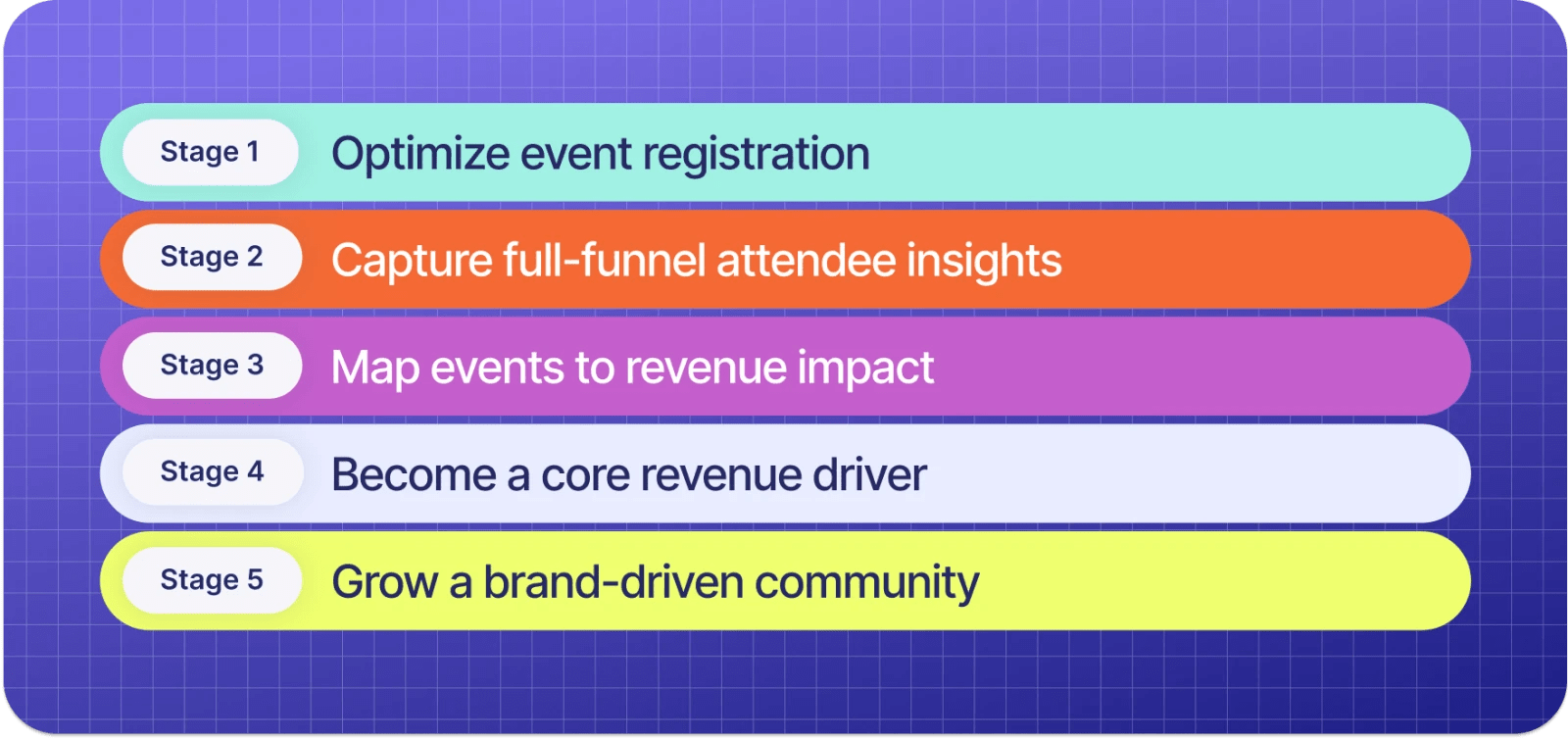
- Your form is Stage 1 of the Event Maturity Model, so nail this foundation or everything else crumbles.
- Every extra form field is friction that kills conversions. Ask for less, but ask smarter.
- Great registration forms use conditional logic and progressive profiling to personalize without overwhelming.
- Mobile-friendly design isn't a nice-to-have—it's where 60%+ of your registrations happen.
Picture this: You just launched registration for your biggest event of the year. You hit refresh on your dashboard. Once. Twice. Twenty times. The numbers? Disappointing.
Attendees seem to be hitting your registration form and then bouncing faster than a bad check, costing you sign-ups.
Potential culprits can range from asking way too many damn questions, poorly designed pages, or even failure on mobile devices.
Regardless of the cause, your registration form is causing friction when it should be getting people hyped. Let's talk about how to fix your registration form so it actually converts.
Why your event registration form matters more than you think
Most event organizers treat registration as a checkbox, but that’s your first fatal mistake.
Your registration form is where you set expectations for your entire event. It's Stage 1 of the Event Maturity Model—the foundation everything else builds on.
🤩 A great registration form:
- Creates a seamless first touchpoint with attendees
- Captures data that drives personalization throughout the event lifecycle
- Reduces friction that causes cart abandonment
- Sets the stage for measuring real business outcomes (not just vanity metrics)
😬 A terrible registration form:
- Asks for your blood type and mother's maiden name before you can see ticket prices
- Breaks on mobile (where 60%+ of people are registering)
- Has zero personality, making your event feel like... every other event
- Collects data you'll never actually use
So yeah, this step matters. A lot.
Key components of an event registration form
Before we get into conversion optimization tactics, let's cover the fundamentals. Every event registration form needs these core elements:
- Contact information: You need to get the deets on who's attending and how to reach them. Think name, email, and phone number—the basics that let you send confirmations, updates, and those inevitable last-minute changes.
- Ticket type and quantity: Offer clear options for different ticket types like general admission, VIP, and group tickets. This helps you manage logistics like seating, catering, and which sessions will be packed.
- Payment details: If your event requires payment, integrate a secure payment gateway alongside clear pricing and a simple checkout process. Remove barriers by supporting multiple event payment methods like credit cards or instant pay options like PayPal and Apple Pay.
- Promo code field: Let people apply early bird discounts or group codes without contacting support. Automation is your friend here.
- Additional questions and preferences: Use conditional logic to capture details like dietary restrictions, accessibility needs, session preferences, or t-shirt sizes—but only when relevant. Don't go asking people if they’re allergic to gluten if they’re buying a virtual ticket.
- Marketing opt-ins: Get permission for future event notifications or newsletters. Make it easy for people to stay in your ecosystem (and for your team to stay compliant).
This is all important information, but the key is to only ask what you actually need right now. You can always collect more information later through event registration confirmation emails or progressive registration.
Tips for designing an event registration form that converts
Want to see how to create an event registration form that actually encourages sign-ups and attendance? Let’s get into the design tactics that separate high-converting forms from the ones gathering digital dust.
1. Keep the form concise and user-friendly
You know that saying “short and sweet?” That’s the goal here.
If your event registration form looks like a tax return, people are out. You only want to ask what you really need to know upfront, and remember that you can always gather more details later.
Here’s how to do it:
- Prioritize must-have fields: Name, email, and ticket type? Essential. Company revenue from the last fiscal year? Maybe not.
- Use multi-step forms: If you need more info at registration, break the process into steps. Multi-step forms convert better than longer, single-page forms as they feel more manageable.
- Leverage conditional logic: Show or hide questions based on previous responses. (Spoiler alert: We talk about this in our next section!)
Progressive registration keeps your form short and sweet for maximum conversions while giving you time to figure out more event details. Capture basic information initially to lock in sign-ups, then follow up with registrants for custom questions later—drumming up anticipation while doing so.
With event registration software like Swoogo, you can access progressive registration capabilities. This allows you to build profiles over time without overwhelming people at the start.
2. Create urgency without being annoying
If people think they can register anytime, they'll procrastinate forever. A little urgency can increase conversions significantly.
Here’s how to do it:
- Use early bird pricing: Limited-time discounts work wonders. Highlight the deadline and price reduction clearly.
- Highlight limited spots: "Only 20 VIP tickets left" adds FOMO without being manipulative
- Add a countdown timer: Seeing time tick down can motivate action
- Be genuine: Don't create fake urgency. If there really are limited spots or a real deadline, communicate it clearly.
3. Use conditional logic for personalized experiences
Conditional logic tailors the form based on attendees' responses.
If someone selects a VIP ticket, additional VIP fields appear. If they're registering as a speaker, they see speaker-specific questions.

The benefits are immediate:
- Forms feel shorter for people who don't need every option.
- You collect more relevant data.
- Attendees get a personalized experience from their very first interaction.
For example: Your event has both speakers and traditional attendees. You’ll need different information from each. You’ll need to learn about a speaker’s proposed topics and expertise, for example, and you may need to invite them to a speakers-only pre-conference dinner. For attendees, you might focus more on areas of interest so that you can recommend relevant sessions to them.
This approach transforms data collection from a chore into a competitive advantage. When someone says "It's like they knew exactly what I needed," you've crushed it. 💪
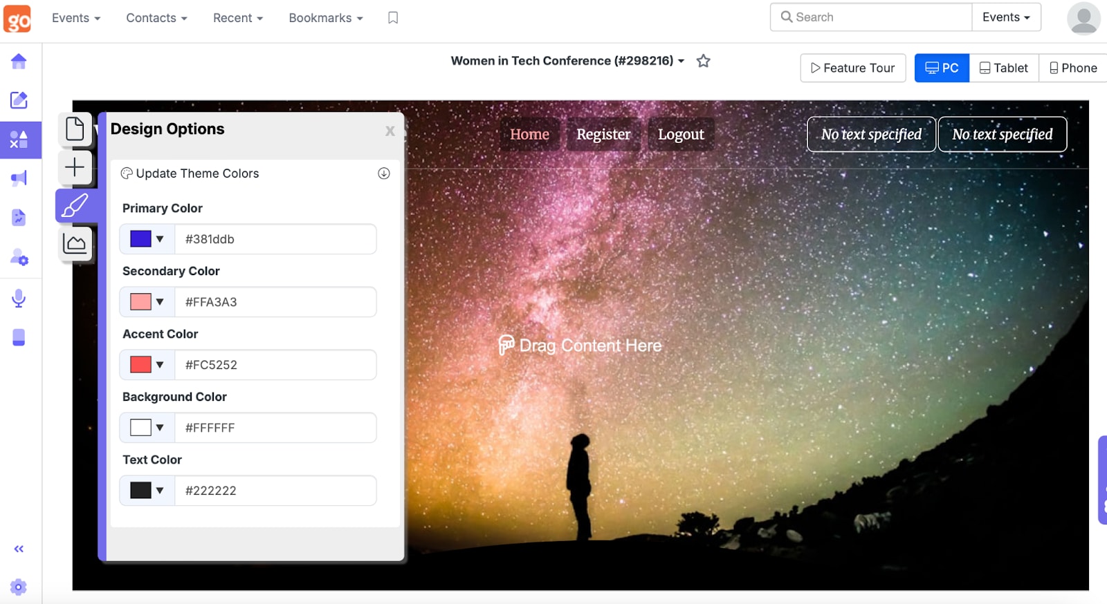
4. Incorporate your event branding
Your event registration form shouldn't look like it was built in 2003. A branded, visually appealing form builds trust and keeps your event top of mind.
Here’s how to do it:
- Match your brand colors and fonts: Consistency is key, and you want that sweet, sweet brand recognition.
- Add your event logo: It’s a small but powerful way to add credibility to your form.
- Use high-resolution images: Fuzzy images instantly cause hesitation. Opt for high-quality visuals or bust (and make sure they look stellar on all device types).
- Customize confirmation pages and emails: Reinforce your event's personality and excitement from start to finish.
Your event management platform should make it easy to create beautifully branded forms without needing a design degree.
At Swoogo, we're firm believers that flexibility and customization shouldn't require a developer on speed dial. You can customize any of our ready-made templates with your own images, colors, logos, and more.
5. Optimize for mobile devices
This is table stakes in 2025, but it bears repeating: People are signing up from their phones, so if your form isn't mobile-friendly, you're losing conversions.
Here’s how to do it:
- Keep text input minimal: Dropdowns and checkboxes are easier to tap than typing on a small screen.
- Use auto-fill and smart defaults: Make it as effortless as possible with auto-fill options.
- Ensure responsive design: The right platform should automatically optimize your registration form for any device.
- Test on multiple devices: What looks great on desktop might be a nightmare on mobile, so take preview and test your full registration process on phones, desktops, and tablets.
Want to really wow your attendees? Consider offering an event mobile app to enhance the attendee experience beyond just registration.
6. Test, test, and test some more!
Even the best event registration form can be improved, and small tweaks can lead to big conversion wins.
Here’s how to do it:
- A/B test form variations: Try different headlines, button colors, or layouts, but only test one component at a time. This can help you determine if Headline B really knocked the socks off your customers instead of wondering if a different change was responsible.
- Analyze drop-off points: If people abandon your form at a certain question, it might be time to rethink it.
- Monitor conversion rates in real-time: If your form isn't converting, revisit your design and messaging immediately.
- Track completion time: Forms that take too long to complete have higher abandonment rates.
Consistent testing can be a game-changer for everything from nailing down your copy to selecting the truly essential event registration questions. It’s worth the extra work.
How to integrate payment processing into your event form
If your event requires payment, this is where most registration forms either shine or completely fall apart.
Critical rule: If someone wants to pay you, make it ridiculously easy.
Limited payment options, confusing checkout flows, or surprise fees at the end are conversion killers. Here's how to get it right.
Choose a reliable payment gateway
Your event payment gateway needs to do two things:
- Process payments securely
- Integrate seamlessly with your registration system
Look for gateways with robust security features like encryption, PCI compliance, and fraud detection.
Popular options include PayPal, Stripe, and Square. These platforms all have exceptional security features and are widely recognized and trusted by customers.
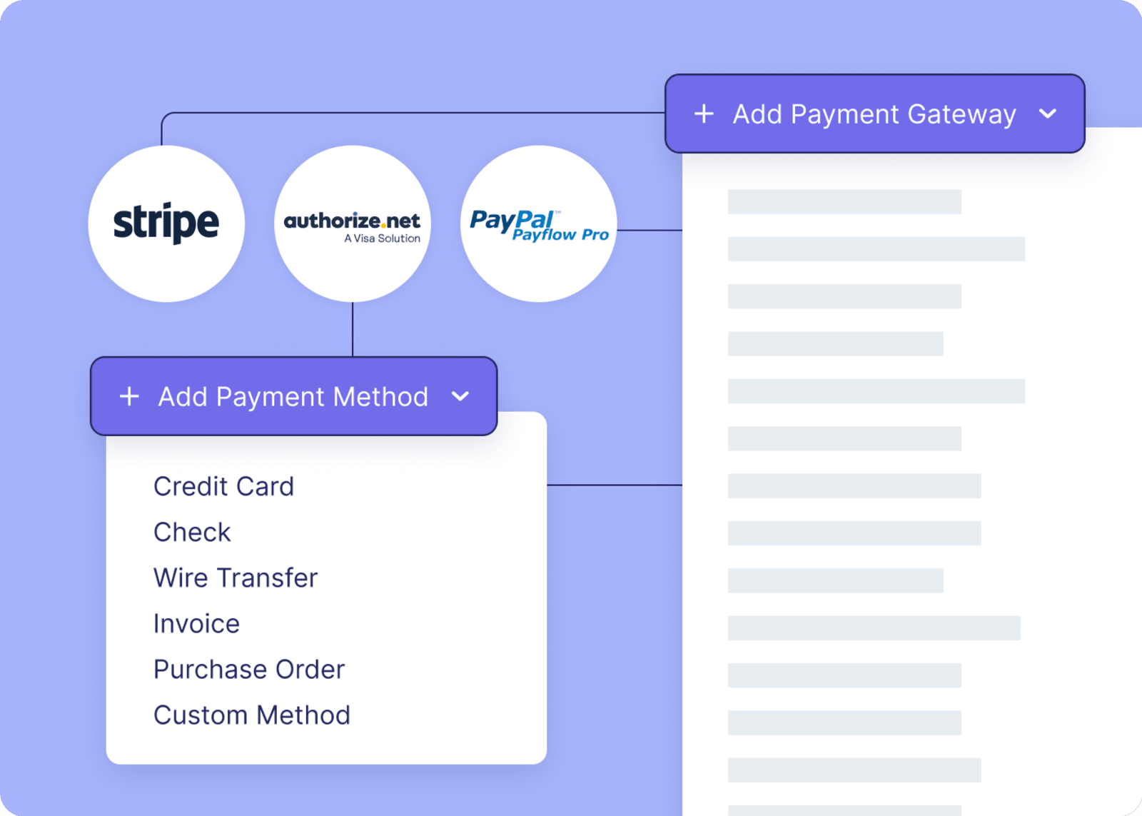
Offer multiple payment methods
Different attendees prefer different payment methods. The more options you offer, the fewer barriers to completion.
Essential payment options typically include:
- Credit and debit cards: The baseline. Support all major card types.
- Digital wallets: Apple Pay, Google Pay, and PayPal for one-click-but-still-secure checkout.
- Invoicing: This is critical for B2B events where attendees need company approval.
- Group payment options: Make it easy for teams to register and pay together in one transaction.
- Partial payments or installments: For high-ticket events ($500+), offering payment plans can significantly increase conversions.
Be transparent
Hidden fees are the fastest way to lose trust and kill conversions. Show the complete cost breakdown before attendees enter payment information.
You should include:
- Base ticket price
- Any processing fees or taxes
- Total amount due
- Refund or cancellation policy
Use clear language like "Total: $299 (includes $15 processing fee)" rather than surprising people at checkout.
Automate price increases and ticket caps
Manual price updates are a recipe for mistakes. Use your event platform to automatically adjust based on your ticket pricing strategy:
- Increase prices when early bird deadlines pass
- Close registration when capacity is reached
- Apply group discounts when thresholds are met
- Track revenue in real-time
This removes the administrative burden while ensuring your pricing strategy executes flawlessly.
Communicate after the fact
Once someone completes payment, they should immediately know:
- Payment was successful
- What they purchased (ticket type, quantity)
- What happens next (confirmation email, event details)
- How to access their ticket or receipt
The event payment confirmation email should include a receipt, invoice (if needed for reimbursement), and next steps. This is also your opportunity to build excitement—remind them why they made a great decision to register.
Many attendees forward payment confirmations to managers or finance teams for reimbursement. Make this easy with clear documentation and downloadable receipts.
Common registration form mistakes event organizers make (and how to avoid them)
Even experienced event pros fall into these traps. Here's what to watch out for:
You ask too many questions upfront: Prioritize must-have fields. Name, email, and ticket type? Essential. Company revenue from the last fiscal year? Save it for later (or skip it entirely).
Fields aren't marked as required: If you absolutely need certain information, mark it as required. Don't make people guess.
Vague or ambiguous form fields: Unclear questions lead to incomplete or inaccurate responses. Use clear, concise labels and provide examples when necessary. Instead of "Organization," specify "Company Name" or "University Name."
Failing to pre-fill or auto-populate data: Making users repeat information (especially returning attendees) creates frustration and increases friction. Use link builders to pre-populate known data whenever possible.
Ignoring accessibility: Not designing for accessibility (like lacking screen reader-friendly labels) excludes users with disabilities. Ensure your form meets current WCAG standards.
Using clunky, outdated software: The best way to avoid most UX mistakes is by working with modern event registration software that's actually intuitive. Look for platforms with unlimited conditional logic, drag-and-drop builders, and mobile-responsive designs out of the box. And for everything holy, make sure that it integrates with a modern tech stack so nothing breaks.
Want to dive deeper? Check out these 23 nasty event registration form UX mistakes and what to do about them.
Event registration form examples to inspire your own
Sometimes it helps to see what great looks like. Here are examples of well-designed registration forms from some happy Swoogo customers.
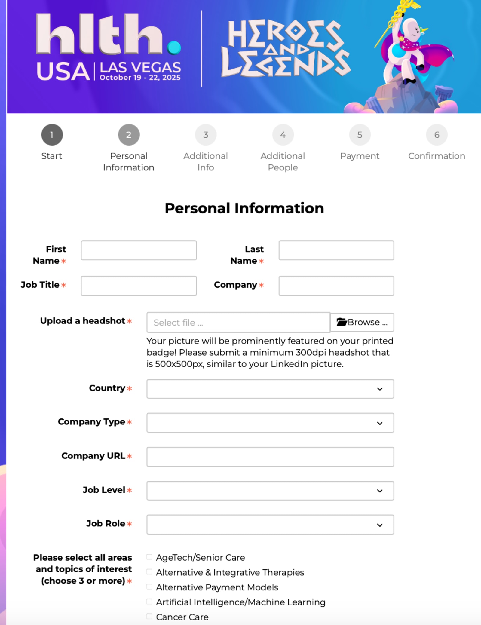
1. HLTH USA
HLTH USA’s 2025 event registration form is an outstanding example to follow. Here’s what this page does well:
- Has a progress bar visible throughout the registration process.
- Asks for relevant information, given the size and content of the event.
- Gives users the option to add additional attendees during their checkout process.
- Clearly indicates which fields are required.
- Provides clear instructions and context, like explaining why a headshot is needed.
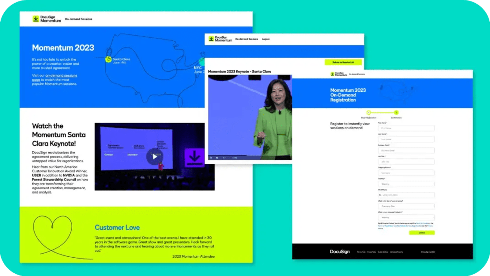
2. DocuSign
DocuSign’s Momentum 2023 event registration form provides some solid inspiration for the following:
- Stresses “instant” and “on-demand” to drive action fast.
- Asks for the essential information and nothing else.
- Uses branded and high-contrast colors to draw user attention where it matters.
- Prioritizes a simple, clean layout.
3. The Vendry + Skift
Looking for an example of a simple event registration form? This example from The Vendry + Skift excels by doing the following:
- Clearly highlights the event’s value proposition directly on the page.
- Only asks for the truly essential information.
- Uses contrasting-but-branded colors to draw attention to the CTA button.
- Has a drop-down menu for dietary restriction options for a frictionless experience.

Making your first impression count (and convert!)
Your event registration form isn't just a form. It's the gateway between interest and attendance. A well-designed, frictionless process can mean the difference between a sold-out event and a last-minute scramble to fill seats.
By keeping it simple, mobile-friendly, and personalized—while leveraging smart tools like conditional logic, automation, and A/B testing—you'll maximize conversions and set your event up for success.
Ready to build event registration forms that people actually want to fill out? Explore Swoogo's pricing or get a demo to see how we help event teams create registration experiences that convert.
FAQ
How do I create an event registration form with Google Forms?
While Google Forms is free and familiar, it has significant limitations for event registration:
- No payment processing means you'll need to use a separate payment platform.
- Limited conditional logic prevents true personalization.
- No integration with event tools means data lives in spreadsheets.
- Basic design customization results in limited branding options.
- No dedicated support leaves you on your own if something breaks.
For simple, free events with basic needs, Google Forms works. But for professional events with payment processing, personalization, and data integration needs, dedicated event registration software will save you time and headaches.
What is the best tool for creating an event registration form?
The best event registration form tool depends on your specific needs, but here are key factors to consider:
- Ease of use: Look for drag-and-drop interfaces and intuitive navigation that don't require a PhD.
- Customization options: You need custom fields, branding elements, and conditional logic that flex to your specific event requirements.
- Integration capabilities: The tool should connect seamlessly with your CRM, email marketing platforms, and payment gateways so data flows smoothly.
- Security features: Ensure the platform complies with data protection regulations and offers encryption to protect attendee information.
- Support: When something goes wrong at 9 PM the night before your event, you need real humans who can help, not canned responses.
Swoogo specifically excels at supporting companies running multiple events annually with complex registration needs, personalization requirements, and the need to connect event data to business outcomes.
What questions should I include in my event registration form?
Focus on questions that serve a clear purpose.
Always include:
- Full name
- Email address
- Ticket type/registration category
Include when relevant:
- Phone number (for in-person events or high-touch experiences)
- Company and job title (for B2B events)
- Dietary restrictions (for events with meals)
- Accessibility needs (to ensure inclusive experiences)
- Session preferences (for multi-track events)
- T-shirt size (if providing apparel)
Consider for deeper personalization:
- Goals for attending
- Specific topics of interest
- Experience level
- Industry sector
How can I reduce cart abandonment in my event registration process?
Cart abandonment is a huge issue in event registration. Here's how to combat it:
- Show total cost upfront: Ditch the surprise fees at checkout
- Offer multiple payment methods: Credit cards, PayPal, Apple Pay, invoicing
- Enable guest checkout: Don't force account creation
- Use progress indicators: Show people how close they are to finishing the process
- Save progress automatically: Let people return without starting over
- Send abandonment reminder emails: Follow up with people who fail to complete the registration
Want templates for those reminder emails? We've got you covered with abandoned event registration reminder strategies that actually work.
How do I make my event registration form accessible?
Accessibility isn't optional. It's essential for inclusive events for both practical and legal reasons, and you want your forms to be up to WCAG standards. Start with these tips:
- Use proper form labels: Every field needs a clear, descriptive label
- Provide sufficient color contrast: Text must be readable for people with visual impairments
- Include alt text for images: Screen readers need descriptions
- Use clear, simple language: Avoid jargon and complex instructions
- Test with assistive technologies: Make sure that your form can be read by tools like screen readers or navigated without a mouse.
Modern event platforms should handle most accessibility requirements out of the box, but always test to be sure.