

Simple. Easy. Fun to use.
Those three tenets have lived at the core of Swoogo since the company was founded in 2015; an answer to clunky, overly-complex incumbents in the space.
At the time, Swoogo was built to meet and exceed user expectations of what it felt like to interact with event technology; sophisticated design and streamlined workflows, established to meet users at the crossroads of expected behavior and unexpected delight.
In the nine years since Swoogo launched, trends in user experience design have evolved significantly. Looking at the state of our product through a 2024 lens, the workflows that felt fun and simple for users in 2015 now lacked the familiar, modern elements that make operating inside of today’s software products straightforward and intuitive.
And so, it’s time for a change.
Today, we’re incredibly excited to announce the launch of Swoogo’s modernized UI; a set of changes that not only make our product more exciting to look at, but bring us back to the tenets that have always been our north star.
Improved workflows, modern design, new event themes— and it’s not bad to look at, either.
This release marks the first update of several as part of our ongoing commitment to improvement in our product. We’re looking forward to introducing enhancements across many Swoogo functions in the coming months, all built on the foundation laid by this update to our platform’s operational workflows.
So with no further ado, allow us to introduce our Swoogo Summer Refresh. We can’t wait to bring you along for this ride.
Key UI Changes
Focused workflows
The primary goal of our refresh is to make building and managing your events fast and easy. Creating focus is central to that goal. New flyout panels let you add, edit, and save all while staying on-page so you can make changes quickly and easily and drop right back into your workflow.
Historically, editing content within a workflow involved leaving the page. For example, when editing ‘registration types,’ then editing a single ‘type,’ you’d leave the ‘registration types’ page to make your update.
With flyout panels, you’ll stay on the ‘registration types’ page and edit the single ‘type’ in a panel that slides out; this helps you see what you’re doing in context of the rest of the page, and drops you right back where you started when you’re done.
To keep things even more streamlined, the ‘Save’ button now scrolls with you, so you can easily save your work from anywhere on the page.
Flyout panels and ‘sticky save’ are now applied across Swoogo workflows, so you spend less time navigating and more time getting sh*t done.
More intuitive navigation
Close your eyes. You need to navigate to a different workflow inside a piece of software. Where’s the menu?
Chances are, you said ‘on the left’— and that’s because left-hand justified menus account for the vast majority of Web interface designs in 2024.
So, we’ve updated our navigation to a standard left-hand panel menu to make moving through Swoogo as intuitive as possible.
Related workflows are now grouped in nested tabs within the panel menu so you can complete work in intuitive sections. Easier to find, fewer clicks. You can also easily collapse tools and workflows you’re not using, so your view stays focused on the task at hand.
Additionally, we elevated ‘reports’ to the primary navigation bar so you can access them quickly and easily; no more layered navigation.

A softer approach to fonts & colors
Swoogo system fonts have been updated to Inter; a sans serif font with a tall x-height, specifically designed to improve readability of mixed-case and lower-case text on computer screens. The update to our fonts makes Swoogo (quite literally) easier on the eyes.
Along with our fonts, we’ve moved away from teal and orange as our primary system colors in favor of the Swoogo brand’s more palatable lavender. Color theory suggests lavender induces peace and relaxation; orange is believed to make you hungry.
While we’re never against an afternoon snack, we hope our new palette will provide a sense of calm as you manage your events.

Beautiful, modern website themes
We know how much design matters; as an extension of our own refresh, we’re introducing new design functions and four brand new themes to give your event a foundation that’s beautiful, inviting, and differentiated.
With our new themes you get access to a whole suite of updated design functionality:
- More options and flexibility in the background imagery. You can choose from full screen, or layered looks, and incorporate Parallax scrolling to provide a sense of depth to your event website to kick-off that immersive experience before your event even begins.
- An extended theme color menu enables you to pre-select 5 colors for your event site: primary, secondary, accent, background, and text. With the updated palette options, you can maintain better brand consistency across your site design, and across all your events.
- Your event experience looks polished and easy to digest with new font weights and font pairings to increase contrast options between text styles on the page.
- Sticky navigation is now available for all four new themes, so your site visitors can always navigate to key site areas (like your registration page 😉) no matter how far down the page they’ve scrolled.
- Pre-built widgets have been paired with the new themes to give you a seamless foundation to build upon and keep your design sleek and streamlined.
We’ve also made a small change to our terminology, updating the ‘background’ section of your site design to ‘hero background,’ so you’re always clear on what you’re editing.
Happy designing!
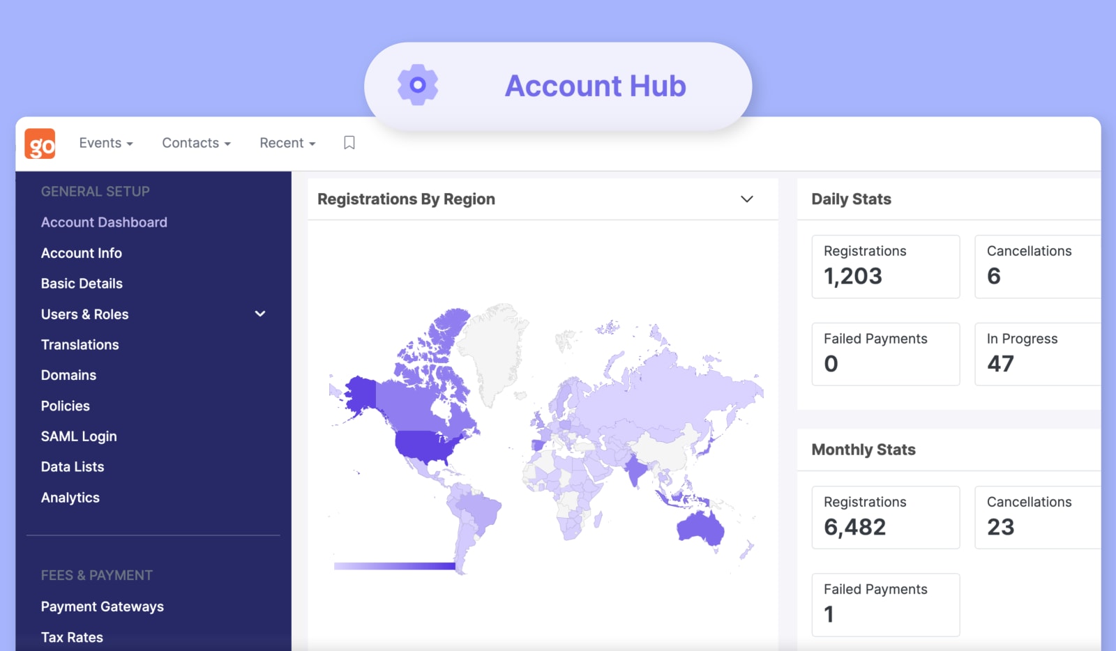
A dedicated place for all your event details
Along with our new approach to navigation, we’ve moved your brand new ✨Account Hub ✨(previously “Account Setup”) to the bottom of the left-hand panel menu for quick access when you need it.
Your Account Hub not only houses the account setup functions you used previously, but now also encompasses your Account Dashboard. We’ve incorporated a layered navigation into the Account Hub to continue emphasizing focus and efficiency as you build, edit, save, and go.
We’ve also introduced a nifty new setting: Under my profile > other settings you now have the ability to define what page you want to land on when you log into Swoogo. That means you can choose your most recent event, always go to your account dashboard, or land right on your ‘All Events’ page.
Better Swoogo, better event outcomes
It’s true that exciting change and established comfort can often feel like a rigid dichotomy; but we hope that with this Swoogo Summer Refresh, we can evoke both for our users.
Of course, should these changes pose a challenge to anyone who encounters them, we would point back to another Swoogo truth that has existed since our founding: our team will be here to support our users through this transition, just like we always have, and always will.
We can’t wait to hear about your experience with this refreshed version of Swoogo, and we’re looking forward to telling you about more soon-to-come innovations in our product.
In the meantime, thank you for your continued trust and support.
It’s hot Swoogo summer, baby ☀️ Let’s go have a White Claw.