
Ah, event registration. The middle child that doesn’t get as much love as the actual event itself.
You and your team spend months obsessing over speakers, venues, and swag—but the lead-up stuff (like the good ol’ registration form) often gets left on the back burner. And I get it. You’ve got way bigger fires to put out than setting up conditional logic or fixing a clunky drop-down menu.
But here me out: a thought-out event registration flow can turn that “eh, maybe later” into “heck yes, I’m in!” Reg is your event’s very first impression. And when even minor friction (extra clicks, confusing copy, slow mobile load) sneaks in, your conversions take the hit.
The good news? You don’t have to rebuild your entire registration flow from scratch to fix it! As the classic saying goes, “It doth not do to toil harder, but smarter.” - Shakespeare (probably)

Tiny, thoughtful tweaks—like autofill, progress indicators, or personalized confirmation emails—can drastically improve sign-ups and make life easier for your attendees. So let’s get into it.
Optimizing your registration forms
1. Keep your forms short and essential
If you wouldn’t ask it at the on-site reg desk, don’t ask it in your form. When people are signing up, they want smooth and fast. Stick to the must-haves: name, email, and ticket type.
Everything else—dietary preferences, T-shirt sizes, favorite color of lanyard (green, thanks for asking)—can wait until a later step, such as a post-registration survey.
Long forms feel like work. Short forms feel easy. A couple clicks and you’re done.
And if you truly want to get into the nitty gritty of your forms, here’s our event registration form best practices—clear, practical, and actually useful (we promise).
2. Personalize forms with conditional logic
Instead of making attendees slog through irrelevant details and boxes, use conditional logic to show or hide fields based on what someone selects.
👉 If a registrant chooses “VIP,” reveal fields about your exclusive networking dinner.
👉 If they’re a speaker, open up the session submission form.
👉 If they’re interested in taking part in mentoring, ask follow up questions around topics, experience level, and availability.
By personalizing your event registration flow, your future attendees only see the info they care about. And the result? Less drop-off. More conversions.

“Managing registration for over 7,000 attendees in 11 US cities on the same day is complicated! Swoogo made it a breeze! The conditional logic makes it easy.” - Dustin S., Via G2
3. Enable auto-fill and social media login
No one enjoys typing in their email or name into yet another form—especially on their phones. To put it bluntly: every extra keystroke or tap is an opportunity for someone to give up (or get distracted).
To nip this struggle in the bud, let people sign up in one click using Google, LinkedIn, or Apple authentication.
For returning attendees, pre-populate their info from past events. It’s like saying, “Hey, we remember you!” without being creepy.
Both are tiny conveniences that show you actually care about their experience, which is exactly what great event registration UX is all about.
4. Add progress indicators
Multi-step event registration flows aren’t the problem—mystery is.
The real difference between a good vs bad registration form often comes down to how clearly you set expectations.
When people don’t know how much is left, their brains go straight to “this is going to take forever,” and you can practically hear the tab closing. A simple progress bar or message like “Step 2 of 3—almost there!” keeps expectations clear and motivation high.
It’s a small visual cue, but it gives people that satisfying sense of momentum—like watching a download bar inch toward 100%. The closer they get, the less likely they are to quit.
Keep each step balanced—if step 1 takes two minutes and step 2 takes ten, that progress bar turns from motivator to liar real quick.

5. Make your error messages actually helpful
Nothing kills momentum like “Invalid input” or, my personal worst enemy, the super vague “Error.” Invalid what? What’s the error, Steve?!
Error messages should sound human, not robotic. And, most importantly, they should actually spell out what went wrong, rather than leave your attendees frustrated, confused, and just straight up guessing.
Instead of:
❌ Invalid input 🤮
❌ Required field missing
❌ Error: submission failed
Try:
✅ Looks like your email’s missing an ‘@.’ Want to try again?
✅ Hmm, we couldn’t verify those card details—mind double-checking them?
✅ This field needs a few more characters. Try adding your full company name.
Remember that your tone matters—keep it friendly, clear, and respectful. Helpful always beats punitive.
Keep your error messages near the problem itself. Don’t make people scroll to the top of the page to find out what they did wrong. Highlight the field and (if possible) validate inputs in real-time so people can fix things as they go.
Improving your sign-up experience
6. Prioritize mobile sign-ups
Over half of all event registrations now happen on mobile, so if your form looks like a game of “tap the microscopic checkbox,” you’ve got a problem.
Here’s your mobile-friendly event sign-up checklist:
- Single-column layout: Side-by-side fields are chaos on a small screen. Stack them neatly.
- Big, tappable buttons: If it can’t be hit with a thumb, it’s too small. You could say it’s a…rule of thumb. 😏
- Minimal scrolling: Break long forms into short steps. Bonus points if you added that progress bar from earlier!
- No tiny dropdown menus: Use radio buttons or toggles whenever you can.
Don’t forget to test your flow on multiple devices and browsers before you launch. Better yet, actually try registering yourself from your phone, on data, in a rush—just like your attendees will. If the flow’s not easy in that moment, it’s simply not ready.
7. Embed forms on your event microsite
Embedding your form directly on your event’s microsite keeps attendees in one consistent, branded experience from start to finish. They’re already on your site. Don’t make them hopscotch across the internet to give you their info.

Keeping them on one site is easy, builds trust, and is essentially a subtle way of saying, “If registration is this smooth, wait till you see the actual event.” 🫰
8. Support group registrations
One easy way to increase event sign-ups without spending a dime on ads? Let one person register their whole team in a single flow.
It’s convenient, it encourages team participation, and it quite simply boosts your total registrations, which is the number #1 KPI that event professionals (aka you) track.
9. Provide flexible and secure payment options
If people are ready to give you their money, make it secure and easy to do so.
Offer multiple options—credit card, PayPal, ACH, Apple Pay, Google Pay—and make sure your checkout is PCI compliant. Also, don’t underestimate the power of visible trust signals like lock icons or a simple “Secure Checkout” label!
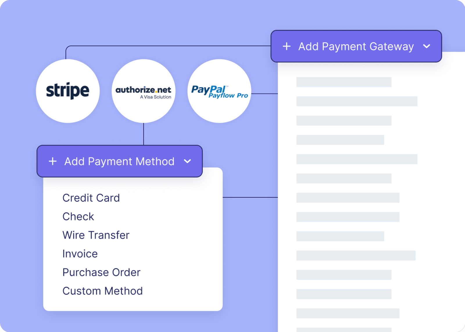
And for your international audience? Support local currencies so global attendees feel confident, comfortable, and like you actually thought about them.
Mastering the post-registration stage
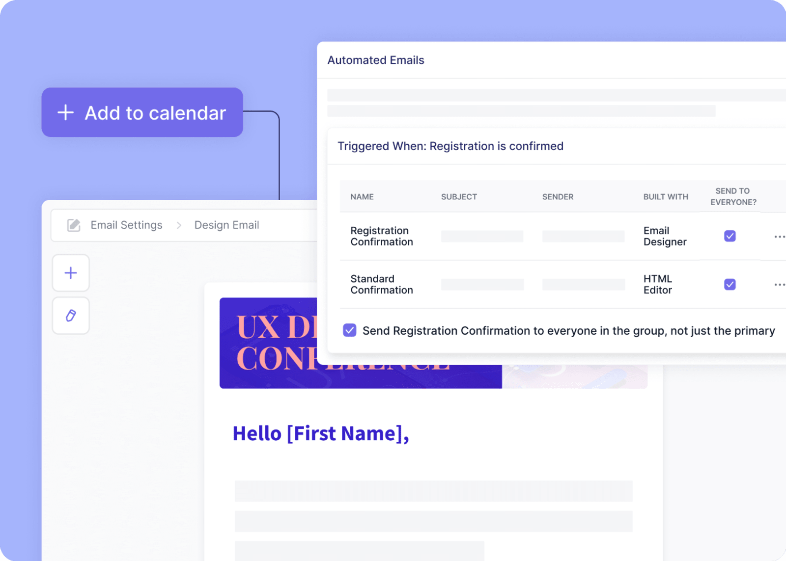
10. Send your confirmation email immediately
That “You’re in!” moment should hit inboxes fast.
Your confirmation email should include:
- A thank-you note (use their name, they’ll notice)
- Event details (date, location, start time)
- An Add to Calendar button
If you have multiple ticket types, personalize the event registration email for each one. A VIP should get info about special access, not general admission check-in times. It’s another seemingly small detail that makes your brand feel organized and attentive.
Set a timer—if your confirmation email doesn’t arrive within two minutes of registering, fix that delay. That’s when excitement is highest.
11. Automate your reminder sequences
Reminders don’t just remind people about your event; they help build excitement leading up to it.
Send a few reminders, spread out in time. For example:
- 1 month before: “Can’t wait to see you! Here’s what’s on the agenda.” Include early prep info, travel tips, or hotel block deadlines.
- 1 week before: “It’s almost go time—here’s your parking map, check-in details, and sessions you might love.”
- 1 day before: “See you tomorrow—here’s your QR code.”
Each message should feel like a friendly tap on the shoulder, not a corporate broadcast. Add a touch of personality, a dash of excitement, and always include something useful—think downloadable agenda, speaker highlights, or a link to connect with other attendees.
To make your life easier (always the goal), automate the sequence and use event reminder email templates—set the flow up once, then let it go. (Yes, like Elsa.)
12. Encourage attendees to share that they’re going!
Your event confirmation page is prime real estate for turning happy registrants into event ambassadors. It’s event marketing that actually feels natural.
Add a shareable post, think: “I just registered for [Event Name]—join me!” and go on to build a bit of hype with a few details of your event.
Include your event keyword , event date, and a social-media-ready image.
13. Use the confirmation page to spur engagement
Don’t treat the confirmation page like a period—make it a comma.
After someone registers, give them options to:
- Choose sessions
- Join a Slack or LinkedIn group
- Download your event app
This is the moment when community starts, not when they show up at the venue.
Applying data to improve future event registration
14. Track drop-off points
Analytics are your friend. Specifically, the brutally honest one who tells you there’s spinach in your teeth.
Check your event registration analytics, see where people drop off, and fix that exact step. For example:
👉 If the most drop-offs happen at the payment step, maybe add PayPal or a mobile wallet.
👉 If it’s on page two of your form, maybe that’s your cue to trim the fields. ✂️
You can’t fix something if you don’t know where it’s broken, so start tracking it.
15. A/B test form elements
Sometimes, one tiny little tweak changes everything. The trick is to test on purpose, not guess and hope.
Start with simple A/B tests. Try changing:
- The order of your fields
- The wording on your CTA (“Register Now” vs. “Save My Spot”)
- Where you place upsells or add-ons
Event registration optimization isn’t a one-and-done thing—this isn’t your first event and certainly won’t be your last. Treat it as an ongoing experiment, where every iteration makes the experience easier for real people.
Don’t reinvent the wheel every time. Use event registration software to templatize what works and duplicate it fast to cut setup time.

16. Collect and act on registrant feedback
After your event, ask one simple question: “On a scale of 1-5, how easy was the registration process?”
If your average is anything under a 4, you’ve got gold in those responses. Use that feedback to smooth next year’s flow. Because “good enough” this year can be “seamless” next year.
You can get this all done with Swoogo!
Here’s the truth: attendees remember ease more than flash.
That’s why the best event registration flows aren’t the fanciest—they’re the most thoughtful. They anticipate needs, remove friction, and make signing up feel effortless.And the same ease you want for your attendees is what we want for you. That’s why we built Swoogo—to take the stress off event teams and give you the freedom to build personal, smooth, totally on-brand experiences without the busywork.
“Swoogo was the event registration system we were searching for, and it ended up being the event management platform we truly love. Simple to use, but with the flexibility to add all kinds of customization.” - Rick T, Director of Engagement at Alberta Canola
With Swoogo, you can:
- Build personalized registration paths for every attendee type (VIPs, sponsors, speakers) using conditional logic.
- Fully white-label forms and embed them directly into your event site—no jarring redirects.
- Trigger smart automations—like VIP alerts, abandoned registration reminders, or custom confirmation paths—with easy “if-this-then-that” workflows.
- Pay one flat, user-based price. No per-registration fees. Test, scale, and experiment as much as you like.
Now go make your registration flow the easiest “yes” your attendees say all year. Happy planning!