Swoogo Summer Refresh

Improved workflows, modern design, new event themes: the Swoogo Summer Refresh has officially landed.
This launch reduces the complexity of creating events in Swoogo: fewer clicks, less time spent building. Plus, the new UI is way easier on the eyes. 😎
UI Updates:
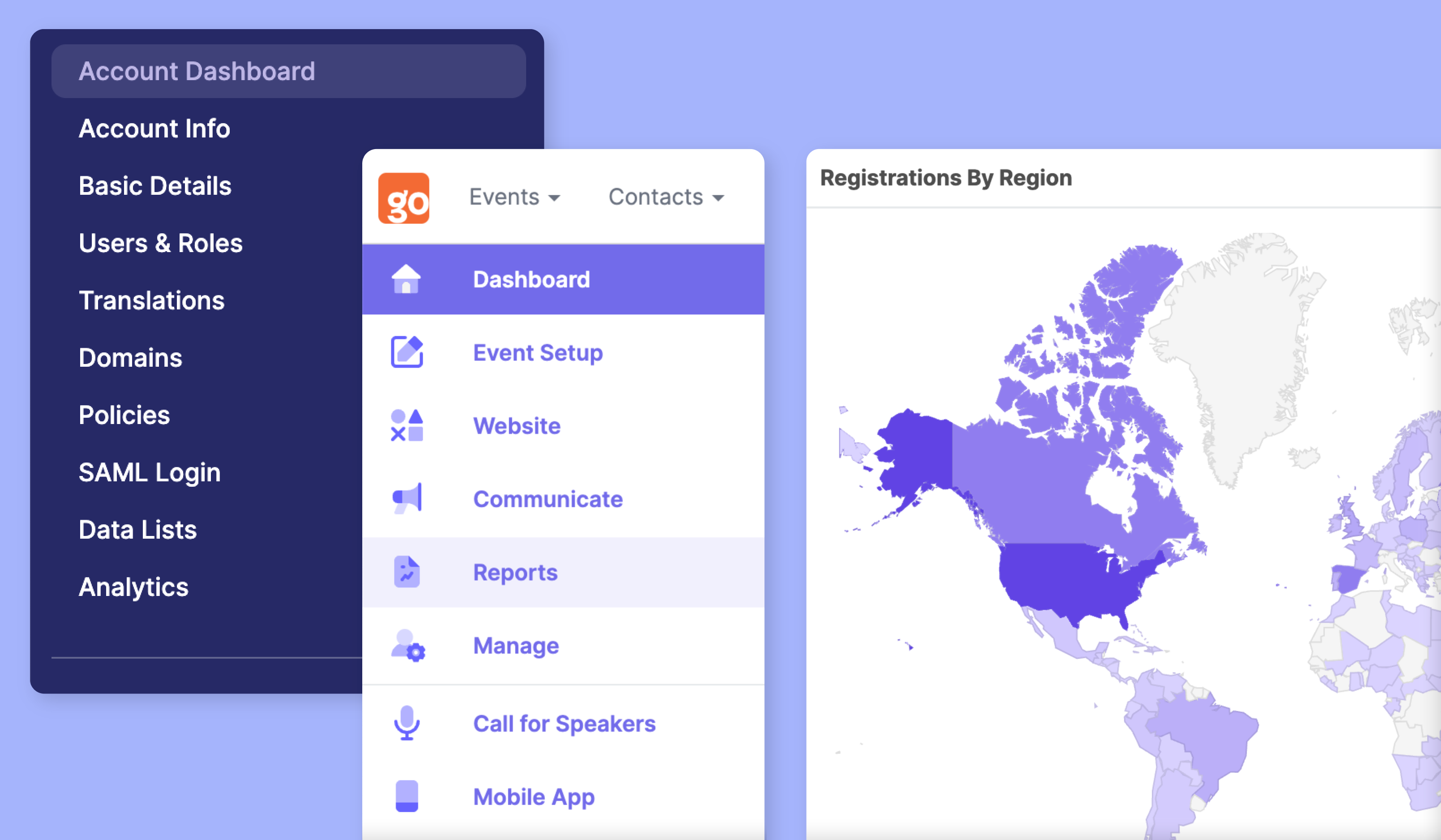
Refreshed Navigation: Nested navigation makes it easier to find what you’re looking for and switch between workflows faster.
Reporting takes the mainstage: Reports have been moved to the primary menu for quick and easy access when you need them.
Fly-out Panels: New fly-out panels enable you to edit what you need without opening a new page, keeping your efficiency at an all time high.
Sticky Save: Now your trusty save button moves through Swoogo with you, so you never have to scroll to find it.
Account Hub: “Account Setup'' has a new name. Access your Account Hub at the bottom of the left-hand panel menu, with a fresh new look to make it easier to find, edit, and go.
[ Take a tour ]

New Website Themes:
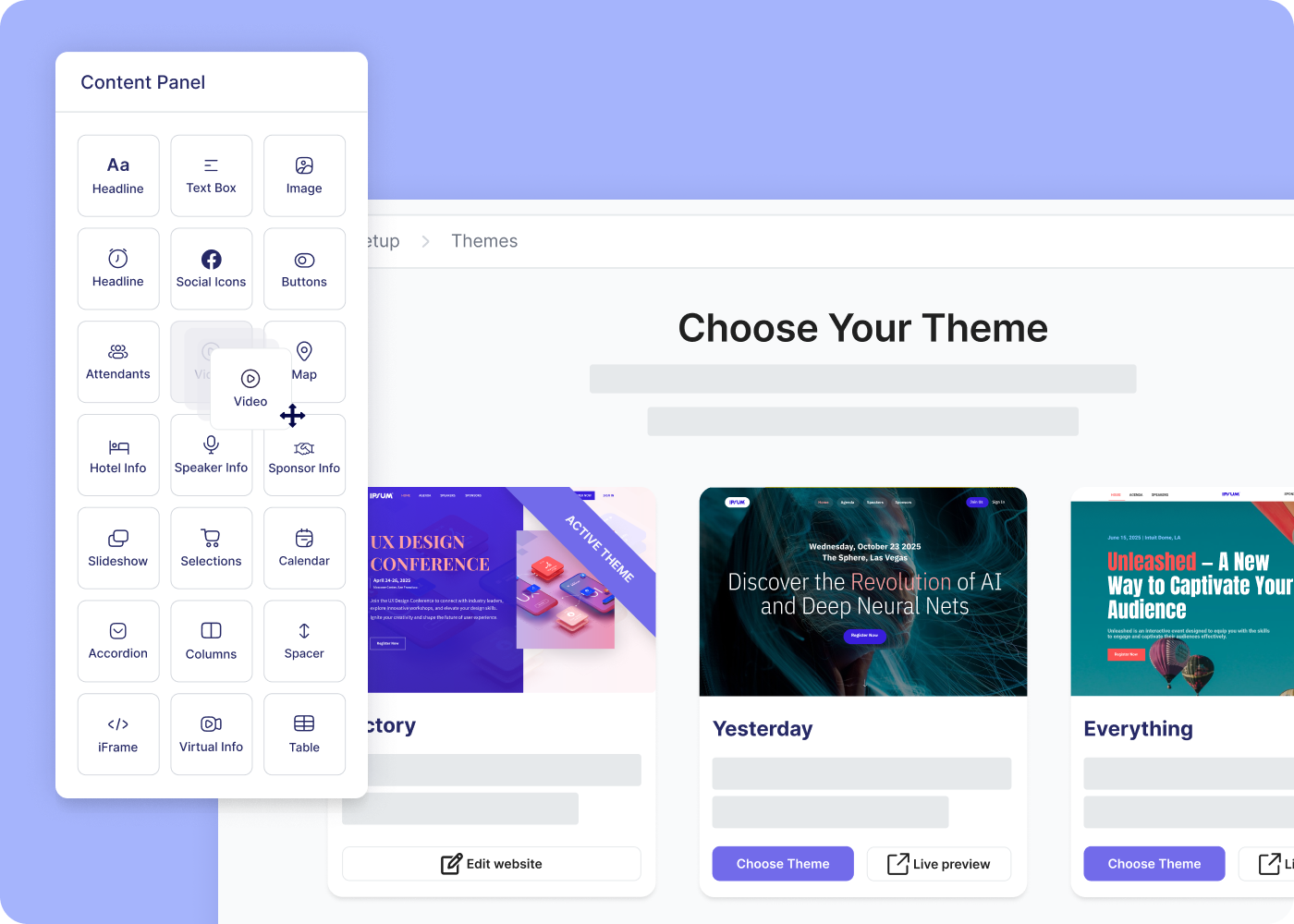
We’ve added four new themes to make your events pop! Each new theme takes design cues from top performing event sites, leveraging innovation in web design that converts.
In these new themes, you’ll find…
More brand control: A new 5-color palette with options for Primary, Secondary, Accent, Background, and Text colors.
Bold font pairings: Bolder fonts and updated font pairings grab your guests’ attention and make your events stand out. These fonts carry through to your website widgets.
Refreshed Hero Imagery: Brand new hero designs, including the introduction of parallax scrolling (a feature that creates depth and motion by varying the speed of scroll between the foreground and background).
Sticky navigation: An option to keep your site’s navigation bar on top of the screen as your visitors scroll, so the ‘register’ button is never far away. 😉
