
Your mobile experience is often the first and last touchpoint your attendees remember. Yet, too many event apps overcomplicate, underperform, or simply break when they’re needed most.
AKA: Yours is probably broken.
And we don’t mean a little glitchy or needs improvement, but we mean actually broken in ways that make attendees want to throw their phones across the convention center.
Here’s the thing: Your attendees don’t really care about your app’s flashy event features. They care about finding their next session, getting updates when Wi-Fi crashes, and not needing a PhD in UX design just to understand the speaker lineup.
They just want the damn thing to work.
Let’s walk through the most common areas where your mobile experience fails, and how to fix them before doors open.
Why your attendee mobile experience sucks
We've seen it all.
Navigation so confusing attendees give up and ask volunteers for directions.
Apps that crash during keynotes.
Networking features that feel like spam factories… or are quiet as a wake.
We get it. Things happen. But, you can be proactive about your mobile experience before it fails you and your guests.ely.
Here are the 11 most common ways event apps fail—and what you can do about it.
1. Your app tries to do everything
Most event apps are having an identity crisis. They're trying to be a schedule, a social network, a gaming platform, AND an AI matchmaking service all at once. The result is a bloated, confusing mess that nobody wants to use.
When you cram in every possible feature—social feeds, scavenger hunts, leaderboards, animated stickers—you're not creating value. You're creating cognitive overload.
Here's how to fix it:
- Prioritize essentials first. Your attendees need schedules, maps, and updates. Everything else is only a nice-to-have.
- Group secondary features under a "More" menu. Let power users discover the extras without cluttering the main interface.
- Use analytics to identify and remove low-use pages. If only 3% of attendees ever opened your "Event Trivia" tab, kill it. 🔪
- Adopt a "two-tap rule." Attendees should find what they need in two taps or less. If they can't, rethink your navigation.
Swoogo lets event organizers decide what's visible to attendees, so your app experience can be as simple or robust as you want. You can ditch the forced features and have more control.
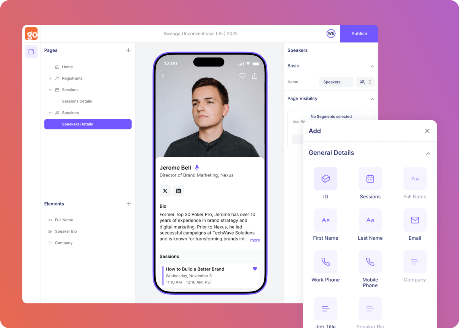
Image suggestion: If the team is able to get access, showing mobile event app design process or personalization options would be great.
2. You’re too dependent on Wi-Fi access
What happens when your attendee walks into a breakout session and the Wi-Fi drops?
Suddenly, they can't see the schedule, find the speaker bio, or even pull up their ticket. The attendee and event volunteers alike can end up frustrated and frazzled.
A mobile experience that requires constant connectivity is setting your attendees up to fail. Conference centers are notorious for spotty Wi-Fi. And hotel ballrooms? Good luck.
Asking attendees to burn through their data plan just to see what's next on the agenda isn’t it.
Here's how to fix it:
- Build offline event app caching for critical content. Schedules, maps, and tickets should work without an internet connection.
- Queue actions for sync when the signal returns. Let attendees bookmark sessions or update their profile offline, then sync later.
- Test on real networks, not perfect lab conditions. Walk through the venue with your app loaded and see what actually breaks.
Swoogo's Go Attend mobile experience prioritizes offline access for key event data, ensuring attendees always have what they need… even when the Wi-Fi doesn't cooperate (because we all know it won’t).
3. Your onboarding process is too complicated
Nobody—and we mean nobody—wants to fill out a seven-field form, verify their email, create a password, and agree to three separate terms of service just to see a schedule.
Much like good registration forms, your event app onboarding should remove friction, not create it.
Complex onboarding kills adoption before it starts. Your attendees are already juggling travel logistics, back-to-back meetings, and questionable conference center coffee. Don't make them work for access to basic information.
Here's how to fix it:
- Offer one-tap sign-in or magic links. Let attendees authenticate with a single click from their registration email.
- Allow "Skip for Now" mode for basic access. They can create an account later if they want networking features.
- Defer permissions until a feature is actually used. Don't ask for camera access upfront, and wait until they actually want to scan a QR code.
- Auto-import attendee info from registration. If they already registered, you have their data. Use it.
4. Your UX is confusing or unintuitive
Aim for clarity over cleverness. A good event app UX isn't about being clever. It's about being obvious and simple.
If your attendees can't find the agenda, session room, or message center in under five seconds, they'll give up. And they'll remember your event as "the one with the annoying app."
Confusing navigation isn't just frustrating—it's a direct hit to your event's credibility. When attendees are frantically swiping through menus while sessions start without them, your brand takes the blame.
Here's how to fix it:
- Keep navigation consistent across pages. Don't move the menu location or change icons between screens.
- Use large, clear touch targets. Nothing smaller than 44px. People have thumbs, not styluses.
- Provide a universal search bar. Let attendees type what they're looking for instead of clicking through five menus.
- Conduct short, real-world usability tests pre-event. Hand your phone to a colleague who's never seen the app. Time how long it takes them to find the keynote session.
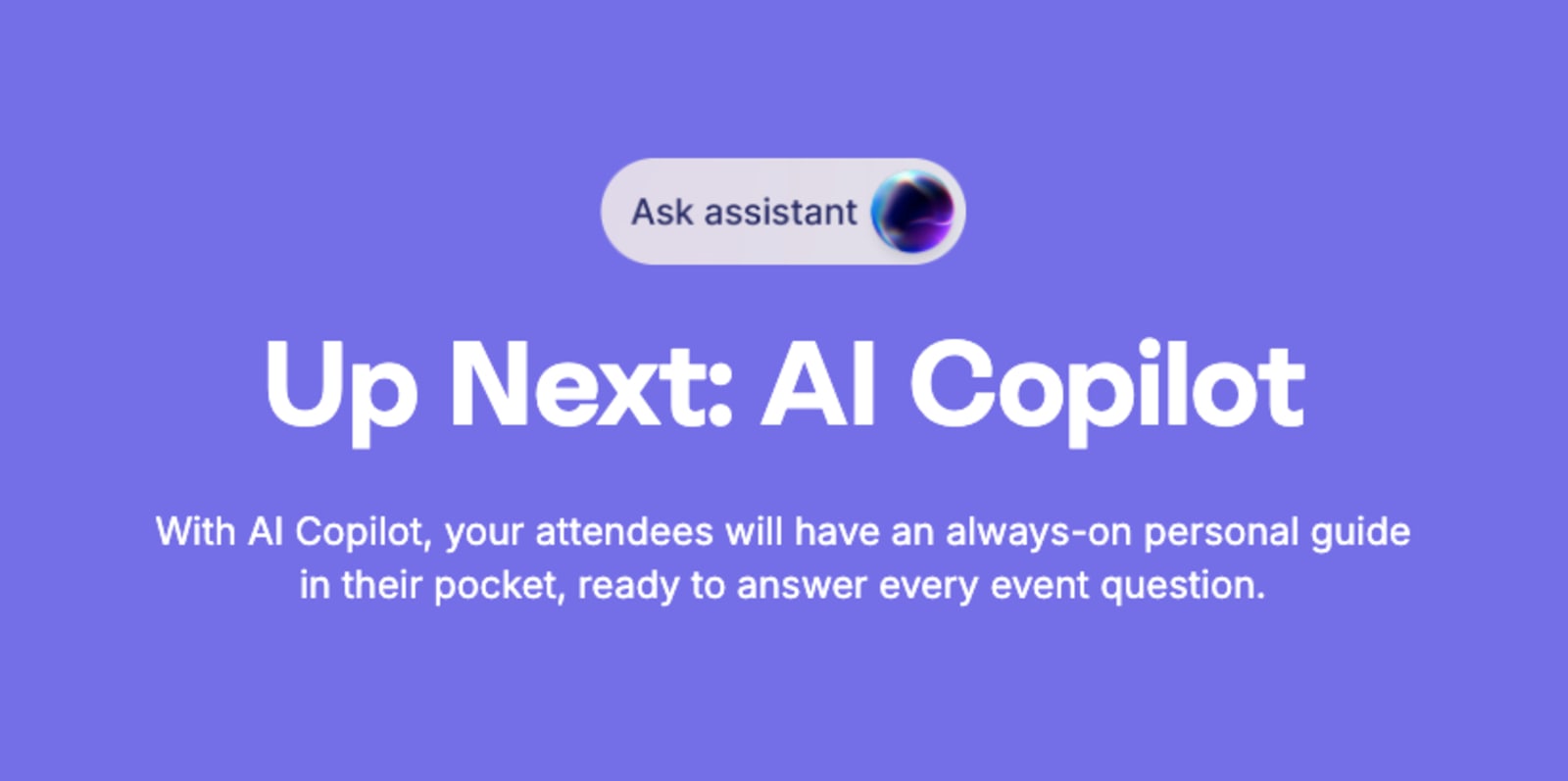
Sneak Peek at the Swoogo Roadmap 👀
5. You didn’t promote the event app properly (Doi!)
Even the best app fails if attendees don't know it exists or why it's worth using. It sounds obvious but based on some events we’ve seen… it apparently is not, and it will impact your event app adoption success.
You can't just drop an app link in the footer of one pre-event email and call it a day. If you want adoption, you need to actively, repeatedly tell people to download it—and give them a reason to care.
Here's how to fix it:
- Introduce it in pre-event emails with deep links. Make downloading the app part of your registration confirmation workflow.
- Add QR codes at badge pickup. Meet attendees right where they're already engaged.
- Mention it from the stage at kickoff. A 30-second callout from a speaker has more impact than a dozen emails.
- Incentivize engagement with polls or check-ins. Run a live poll during the keynote. Offer a prize for completing your session feedback. Make the app useful in real-time.
Swoogo makes it easy to integrate your mobile attendee experience into your registration confirmation and reminder workflows, so you're promoting adoption from the very first touchpoint.
6. Attendees can’t get help when they need it
When tech breaks—and it inevitably will—attendees understandably expect immediate support. If they can't find it, that frustration will show up in how they feel about your brand.
The worst part? Most apps bury support options three levels deep or point to a generic FAQ that doesn't answer their actual question. When an attendee is standing in the hallway, stressed and confused, "Email us and we'll get back to you in 24 hours" comes very, very far from cutting it.
Here's how to fix it:
- Add an in-app "Need Help?" button with real human support. Make it visible on every screen.
- Create a mobile-friendly FAQ. Short answers. Searchable. No corporate jargon.
- Use on-site signage with support contact info. Sometimes low-tech solutions (like a poster) are the most effective.
Swoogo's human support team is known for responsiveness… because great events don't always have time for support tickets! When you need help, you get a real person who actually cares about solving your problem.

“The Swoogo customer service is on point. Quick responses with detailed info to support you every step of the way.”Angie Neas, Senior Field Marketing Manager @ Justworks
7. Your networking features are overwhelming
Networking tools that show every attendee at once turn valuable opportunities into noise.
Imagine opening your app and seeing 2,000 attendee profiles with zero context. No filters. No recommendations. Just an endless scroll of names and headshots. That's not networking—that's chaos.
Here's how to fix it:
- Allow filtering by role, company size, or interests. Let attendees narrow down to people who actually matter for their goals.
- Surface "recommended matches" based on shared sessions. If two people are attending the same three breakouts, they probably have aligned interests.
- Prevent spammy mass messages. Nothing kills networking faster than everyone getting blasted with generic "Let's connect!" messages.
Swoogo's attendee personalization options make targeted, relevant networking easy to design from the start, so your attendees connect with people who matter—not just anyone with a badge.
8. Your notifications are irrelevant or poorly timed
Think of push notifications like seasoning: A little enhances the experience. Too much ruins it.
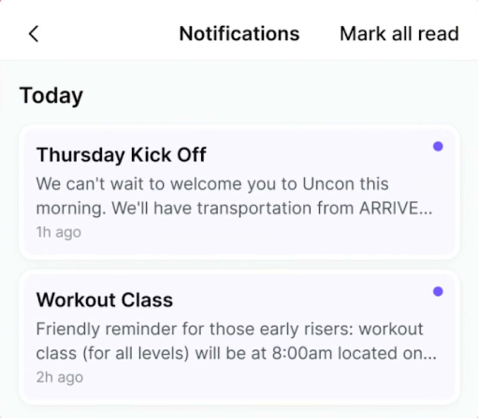
Push notifications that interrupt sessions or repeat irrelevant info quickly get silenced. And once attendees turn off notifications, you've lost one of your most powerful engagement channels.
Sending a "Welcome to the event!" push at 2 a.m. because you didn't segment by time zone? That's how you end up in the "Do Not Disturb" pile.
Here's how to fix it:
- Segment by attendee type or schedule. Don't send session reminders for tracks that people aren't attending.
- Use time-boxed and location-aware notifications. Only send "Session starting in 10 minutes" to people who actually registered for that session.
- Replace multiple pushes with a single daily digest. One helpful summary beats five scattered alerts.
9. Your app ignores accessibility
If your app can’t be used with assistive devices, you're excluding part of your audience. And that's not just bad UX. It's bad business.
Accessibility isn't a nice-to-have feature. It's a baseline requirement—and even a legal one. Yet too many mobile events launch with tiny text, low-contrast colors, and zero screen-reader support.
Here's how to fix it:
- Ensure sufficient color contrast. Use tools like WebAIM's contrast checker to verify readability.
- Enable font scaling and screen-reader support. Let users adjust text size without breaking your layout.
- Test focus order and labels. Make sure someone navigating with a keyboard or assistive tech can actually use your app.
- Offer dark mode for comfort. Some attendees prefer it for readability or eye strain.
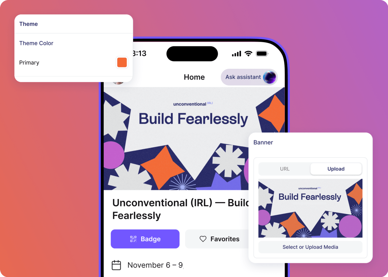
10. Your branding feels generic and boring
If your app looks like your vendor's, not your event's, it hurts brand continuity and credibility.
White-label templates are fine as a starting point. But if your app looks exactly like the 50 other events using the same platform, you're missing an opportunity to reinforce your brand and create a cohesive experience.
Here's how to fix it:
- Customize colors, fonts, and iconography. Make it unmistakably yours.
- Add your logo and sponsor placements tastefully. Visible but not obnoxious.
- Keep the design cohesive across web, mobile, and signage. Your attendees should feel like they're in the same branded experience whether they're on your website, in your app, or walking past your signage.
Swoogo's mobile branding options let organizers own the full look and feel, no cookie-cutter templates required. Build an experience that actually feels like it came from your brand.
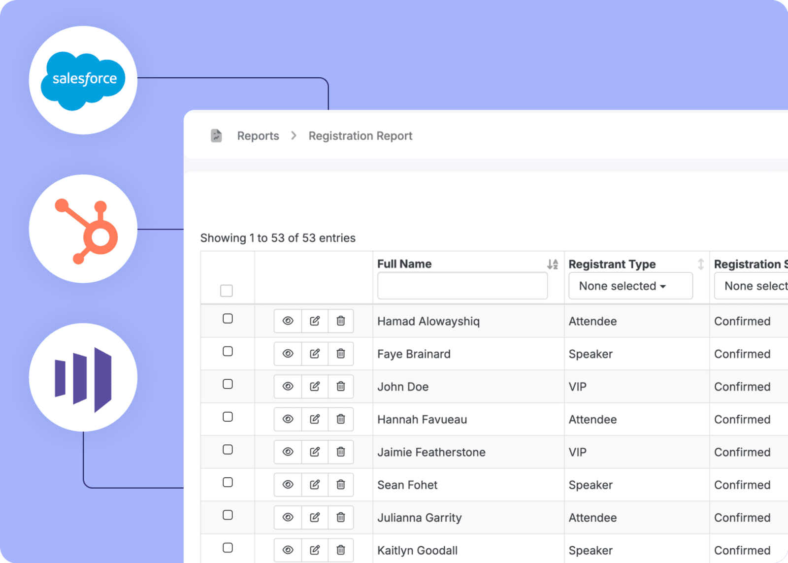
11. Your mobile data isn’t syncing with your CRM
If attendee engagement data stays locked in your app, you're losing insight into what actually worked. And worse, you can't prove ROI.
You spent months planning this event. Your attendees engaged with sessions, connected with speakers, and interacted with sponsors. But if that data doesn't flow into your CRM or marketing platform, it might as well not exist.
Here's how to fix it:
- Sync attendance, favorites, and session ratings to your CRM. Know who showed up, what they cared about, and how engaged they were.
- Track mobile interactions by attendee type. Are your VIP attendees using the app differently than general registrants? That's useful intel.
- Use analytics to improve next year's event. Data from this event should inform decisions for the next one, leveraging what you’ve learned to increase event revenue.
Image suggestion: Flowchart showing mobile app data seamlessly flowing into a CRM system with clear data points (attendance, engagement, session feedback).
Swoogo's open API and integrations push mobile data directly into your CRM or marketing platform—like HubSpot, Marketo, and Salesforce—for full ROI visibility. You can ditch the manual reports and the data silos to get the insights you actually need.
What a great attendee mobile experience actually looks like
Now that we've covered what not to do, let's talk about what success actually looks like. Because creating a great event app isn't magic, it's intentional design focused on what attendees actually need.
Here's what a great attendee mobile experience delivers:
- Agenda and map accessible offline. No Wi-Fi? No problem. Your attendees can still navigate the event.
- Simple onboarding and personalization. Get attendees in fast, then tailor the experience based on their interests and schedule.
- Contextual notifications, not noise. Relevant, timely alerts that help instead of annoy.
- Seamless data flow into your CRM. Engagement metrics sync automatically, so you can measure success and prove ROI.
- Clear event app navigation and two-tap access. Everything important is easy to find. No map required.
- Branding that feels. The app is an extension of your event, not a generic template.
When you nail these fundamentals, your attendees won't even think about the app—they'll just use it. And that's the goal.
For a complete checklist of what to include, see our Event App Checklist.
Don’t sweat your mobile experience, Swoogo’s got you covered
We know you’re already juggling vendors, speakers, sponsors, and that one executive who keeps changing the keynote slides. The last thing you need is your mobile experience becoming another source of stress. When that happens, you’re not just creating a crummy digital experience, but impacting the attendee’s onsite experience, too. Yikes.
The good news is that a great event app UX doesn't require a massive tech team or a six-figure budget. It only requires the right platform and a clear focus on what actually matters.
Here's how Swoogo makes it easy:
- Flexibility and control. Customize everything attendees see without relying on developers. Build the experience your way, not ours.
- Offline reliability. Access key content even without Wi-Fi, so your attendees stay informed no matter what the venue's network does.
- Personalization. Use conditional logic to deliver relevant schedules and notifications based on attendee type, interests, or registration details.
- Data portability. Connect engagement data directly to your CRM, so mobile interactions become insights you can act on.
- Predictable pricing. Scale mobile adoption without per-registration fees. Host as many events as you want without surprise costs.
- Human support. A dedicated team that has your back when doors open—because the best event tech includes actual people who care.
Your attendees don't need bells and whistles. They need tools that work. And when your mobile event experience just works, everyone wins.Want to see how Swoogo handles mobile differently? Check out our full mobile events platform.