
Imagine yourself filling out a long and cumbersome form to register for an event. After spending a few minutes finding your credit card (it’s probably upstairs—why is it always upstairs?) and billing details, you click “Register” only to encounter your form filled with red error messages.
All of the sudden the browser’s “close” button seems much more tempting than before, right?
Despite the constant innovation, web forms—including event registration forms—remain one of the core barriers between registrants and event marketers.
And any kind of obstacle in filling out the form can lead to frustration, which as a result can lead to drop-outs.
Let’s avoid that.
Here are 23 common event registration form UX mistakes and how to avoid making them
Mistake #1: Registration form fields are too long for their input
The size of an input field should reflect on how much text the user is expected to enter. Fields like postcode or house number should be shorter than street address lines.
Mistake #2: Event registration form fields aren’t automatically pre-populated
Most modern event registration software can pre-load address fields from Google Maps, or pre-populate a registration form with data from your CRM, like HubSpot.
This will save attendees from entering information that should really already be known.
Mistake #3: Fields are inline and not in one column
With the exception of date fields, normal event registration form fields should be in one column and not next to each other.

The reason for that?
With form fields in multiple columns, your registrants are more likely to get super confused and misinterpret the fields. That means extra time and headaches for everyone.
Mistake #4: Fields aren’t made required, even though they should be
If you can, avoid optional fields in forms. If you do decide to use them, clearly label fields as optional and not as not required.
Not sure which questions to ask?
Check out our guide on essential event registration questions you should ask for every event.
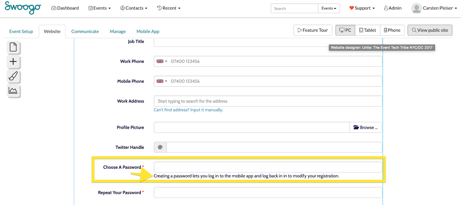
Mistake #5: Password fields are not protected
Any type of password field should really act as a password field, and hide the data entered either through asterisks, e.g. ******* or *$£%!%^ or similar.)
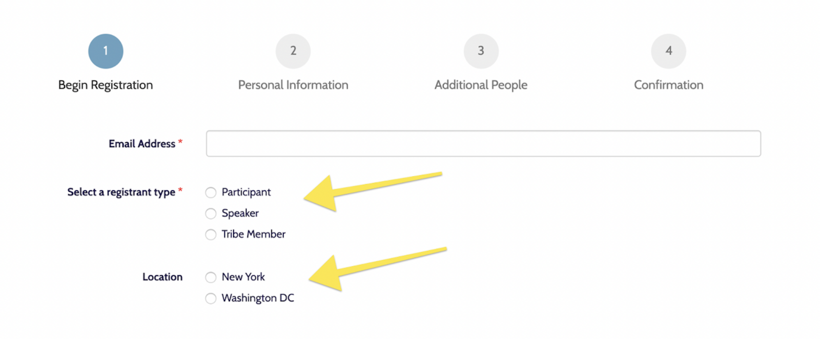
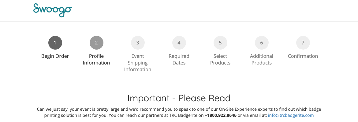
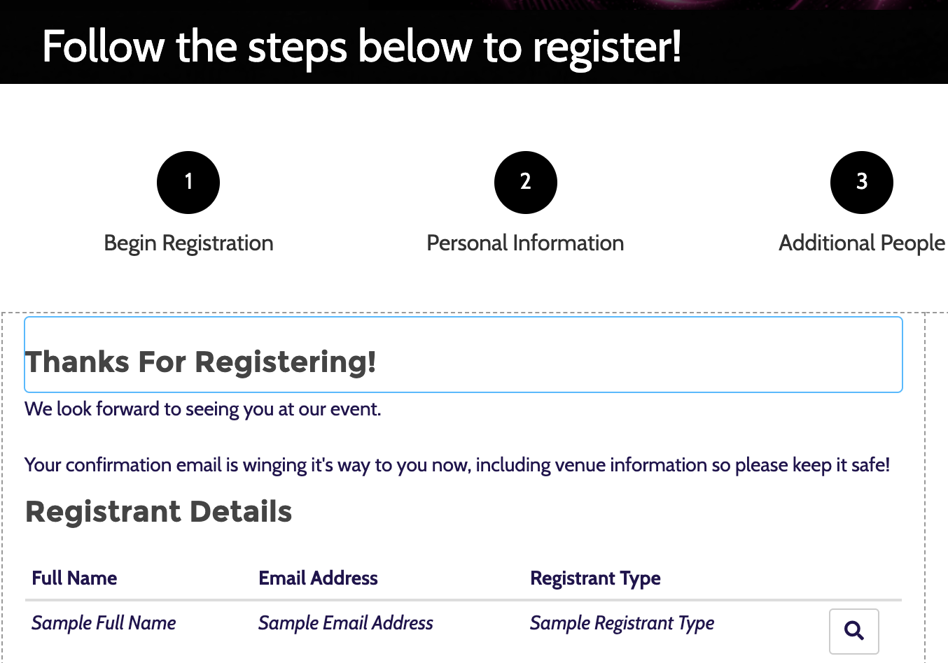
Mistake #6: Using single-step instead of multi-step forms
Why is that?
Splitting the registration form into two or three steps will almost always increase form completion, according to Venture Harbour. The first impression of a multi-step form is less intimidating than a long form with lots of question fields.
Put crucial questions like payment, password, and billing information at the end. Think of it as the carrot on the stick.
Sunk cost fallacy is a proven cognitive bias—users are more likely to fill out crucial questions at the end if they’ve already invested time in filling out previous forms.
Still with me?

Seeing their progress visually, more users are more motivated to complete the form. Even better, display the number of steps until completion.
Mistake #7: Having too many non-essential questions
It’s a fact that too many non-essential questions on your event registration form decrease the conversion rate.

Looking for the essential ones? Here are 9 Essential Event Registration Questions To Ask at every event.
Mistake #8: Not using conditional logic
Instead of overwhelming your registrants with questions that are totally irrelevant, make questions conditional.
Familiar with “If this, then that?” This is exactly how conditional logic works. Someone selects “Yes, I Want a T-Shirt” and a new dropdown field appears, where they can select the t-shirt size.
There’s no point asking for size otherwise, right?
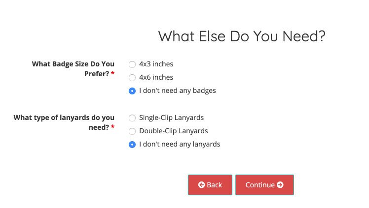
Mistake #9: Stacking radio buttons horizontally instead of vertically
Horizontal arrangement of radio buttons can make it challenging for registrants to tell which label the radio button corresponds to: the one before the button, or the one after? It’s like the SAT all over again.
Vertical positioning of radio buttons is a little safer here.
Mistake #10: Not explaining why you’re requesting sensitive information
People are already understandably concerned about privacy and information security. Therefore, it’s crucial to always make sure you explain why it’s needed. You can use a support text below the field to make this more obvious.
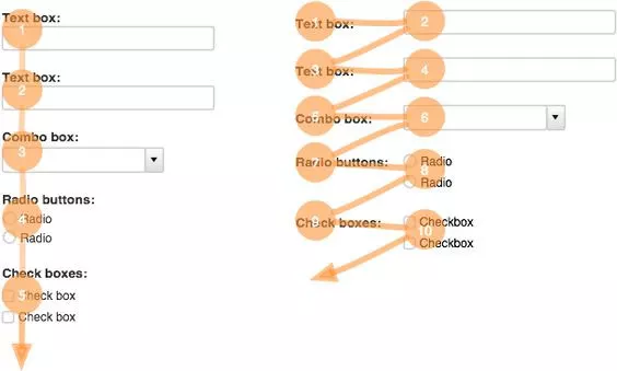
Mistake #11: Top left-aligned labels are best for readability & completion
Google’s UX researchers found out that aligning labels above fields on the left-hand side increases form completion time.
This is because it requires fewer ‘visual fixations,’ as shown in the graphic below, according to UX Movement.
Mistake #12: Not using field labels at all
Form labels tell registrants what the corresponding input fields mean. (No further explanation is needed here.)
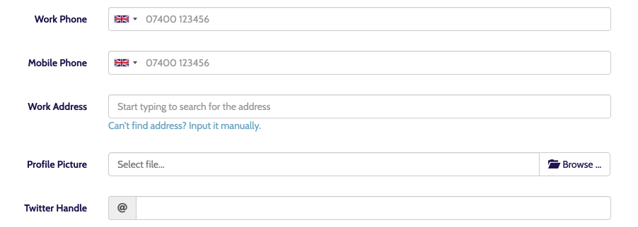
Mistake #13: Making phone number fields required, instead of optional
The best practice for using phone numbers in your event registration is one where users don’t even have to think about phone number formatting or country code, because it automatically displays it for them.

Auto-formatting the input with geolocation is the best way to present phone number fields. As registrants type in their phone number, the proper format is displayed without any effort from them.
This way registrants don’t need to type any parentheses, dashes, slashes, periods, or spaces, and the data you collect will be much cleaner.
Mistake #14: Not allowing attendees to navigate back and forth in the registration form
Sometimes attendees change their minds and need to jump back to the previous step in the registration wizard, without losing all their data.
Mistake #15: Not optimizing your event registration form for speed
Registrants expect forms to be super quick and load fast.
In fact, for every 100 milliseconds Amazon was able to speed up their website, they saw a 1% increase in revenue. The same goes for event registrations. If you want to increase your conversions, ensure your form is as fast as possible.
Mistake #16: Registration form doesn’t work in all browsers
This may sound like common sense, but it’s always good to check that your registration form works—and looks good—on all major browsers and across all devices. Some registrant used Schmoogle.search? Well, that can’t be helped. But optimize for Firefox, Chrome, and Safari for absolute starters.
When in doubt, use a service like BrowserStack.
Mistake #17: Too many questions for each step, in a multi-step form
Really goes against the purpose of multi-step forms.
The goal here is to split up messages logically, so that the user has a clear expectation of what’s happening next. Equally, forcing users to flow through two steps, when there’s only one field in each step, is unnecessary.
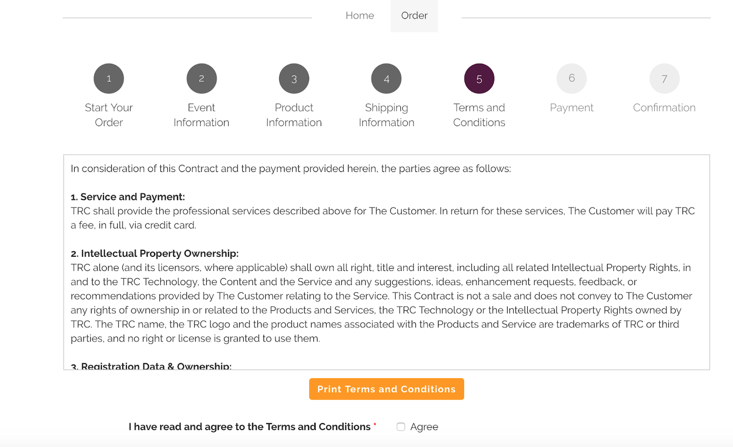
Mistake #18: Placing complex legal messages near buttons
If you need users to agree to disclaimers or terms & conditions, try to combine them into one screen, instead of multiple form fields.
Mistake #19: Not explaining “What’s next?”
When someone registers through your form, they might be wondering how long it will take. You want to make sure you display a visual progress indicator (see mistake #16) but also show a confirmation screen on the last page of the registration.
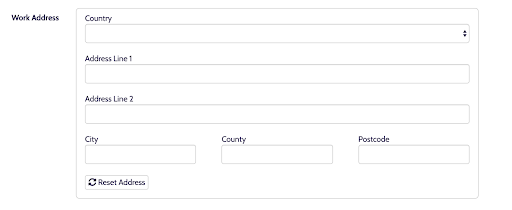
Mistake #20: Using “clear” or “reset” buttons
You don’t need to risk registrants accidentally deleting all the information they’ve previously entered. Most users will be aware that refreshing the page will enable them to start over again.
Mistake #21: Not sequencing your questions logically
Although you want full form control from your event registration provider, in terms of moving questions and pages around as you like, you should always sequence questions logically. For example, don’t ask for a billing address in one place, a mailing address in another, and a home address in still another. Group them together and use conditional logic to allow your registrant to let you know they are all the same address.
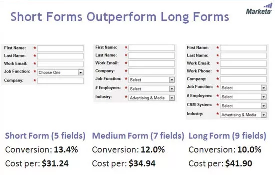
Mistake #22: Your forms are just way too long
’nuff said.
Look at these conversion stats from Marketo. The longer the form, the lower the conversion.
Mistake #23: Not using intuitive event registration software to build event registration forms
The best way to avoid these UX mistakes is by working with an event registration software provided that can deliver an intuitive, flexible, and easy-to-use system that offers unlimited conditional questions and is built on a modern tech stack. Oh weird, we happen to know a software that does just that. It’s us! The software is Swoogo. Stop letting other event software cause you headaches, get a demo of the new way to event (spoiler alert: it comes with fewer headaches and more support.)